


Care in
Every Detail


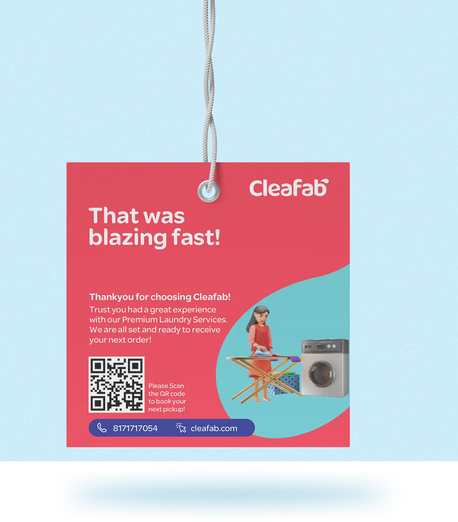


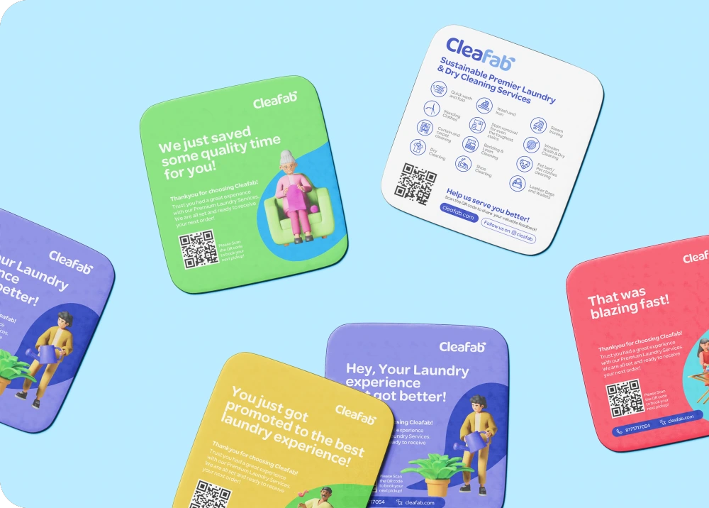


Packaged Like
New


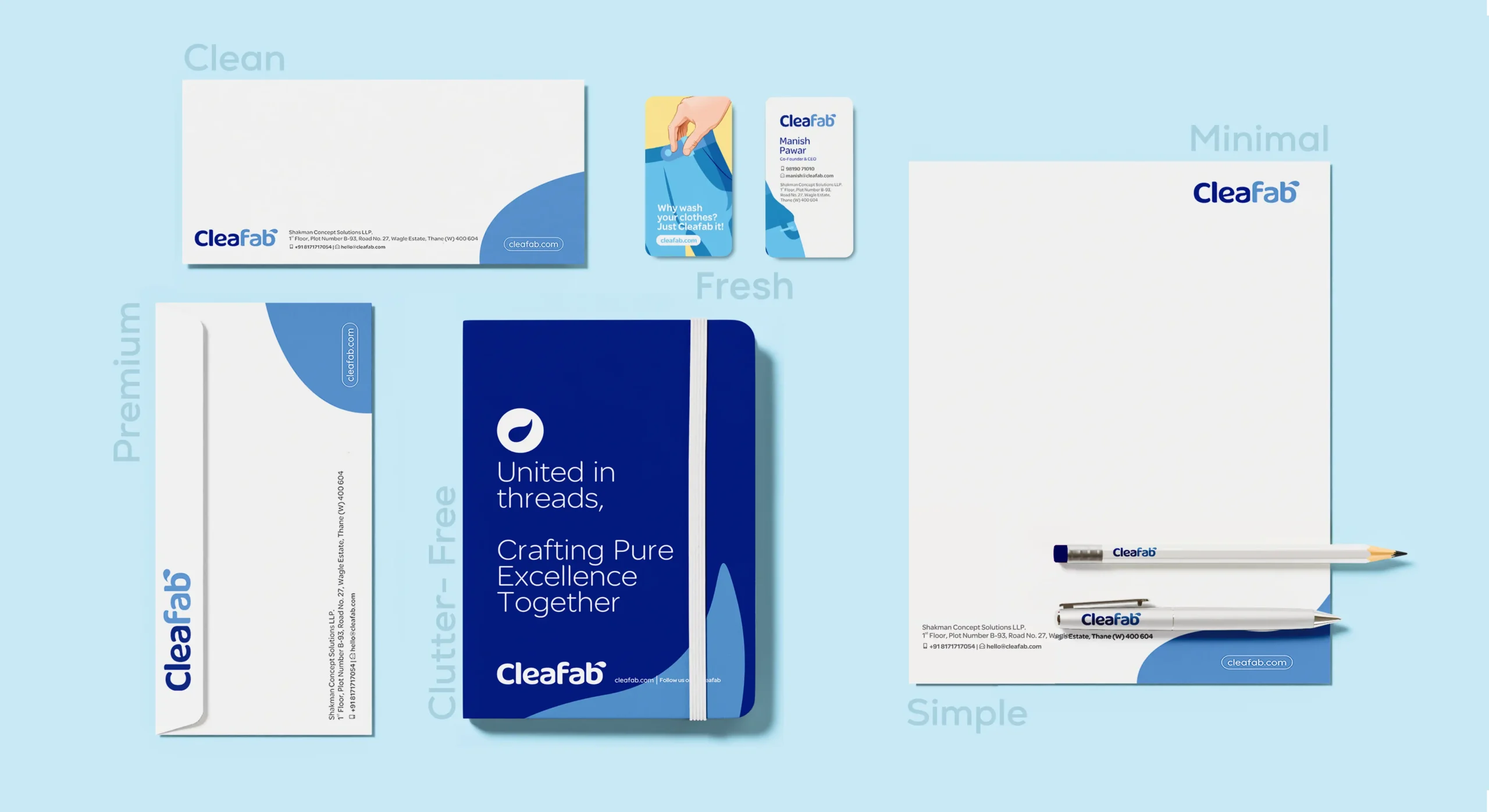
The First
Impression
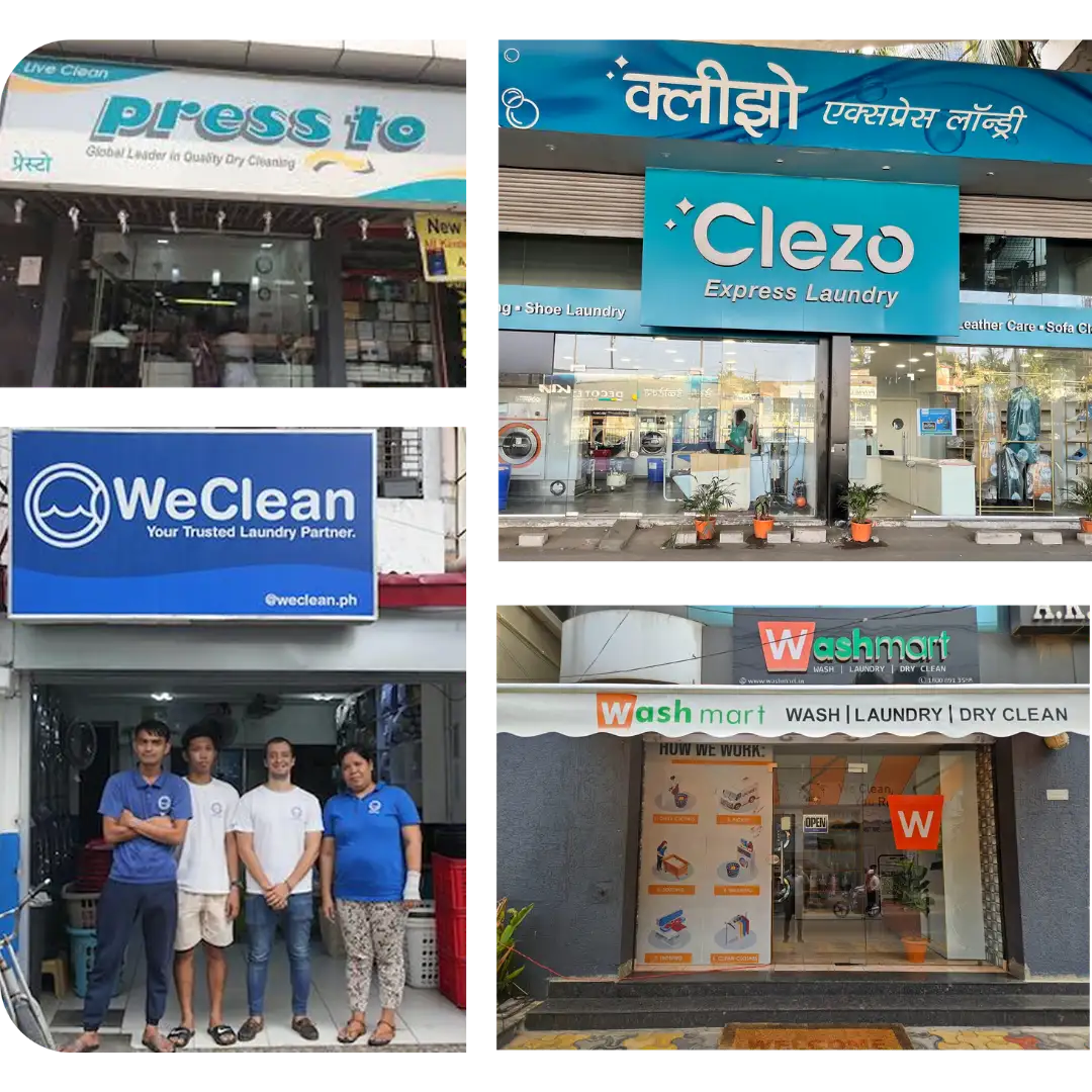
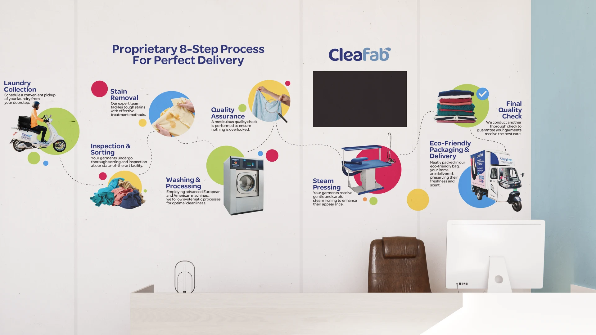
Welcome to the
Cleafab Space


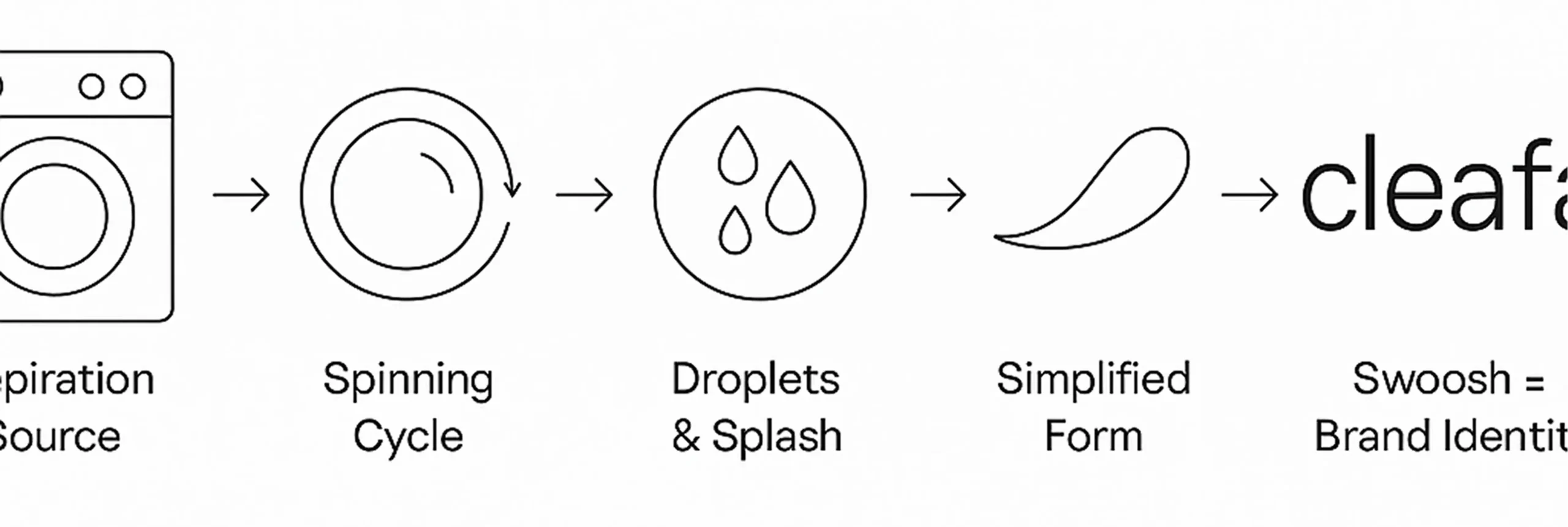
Delivering the
Brand


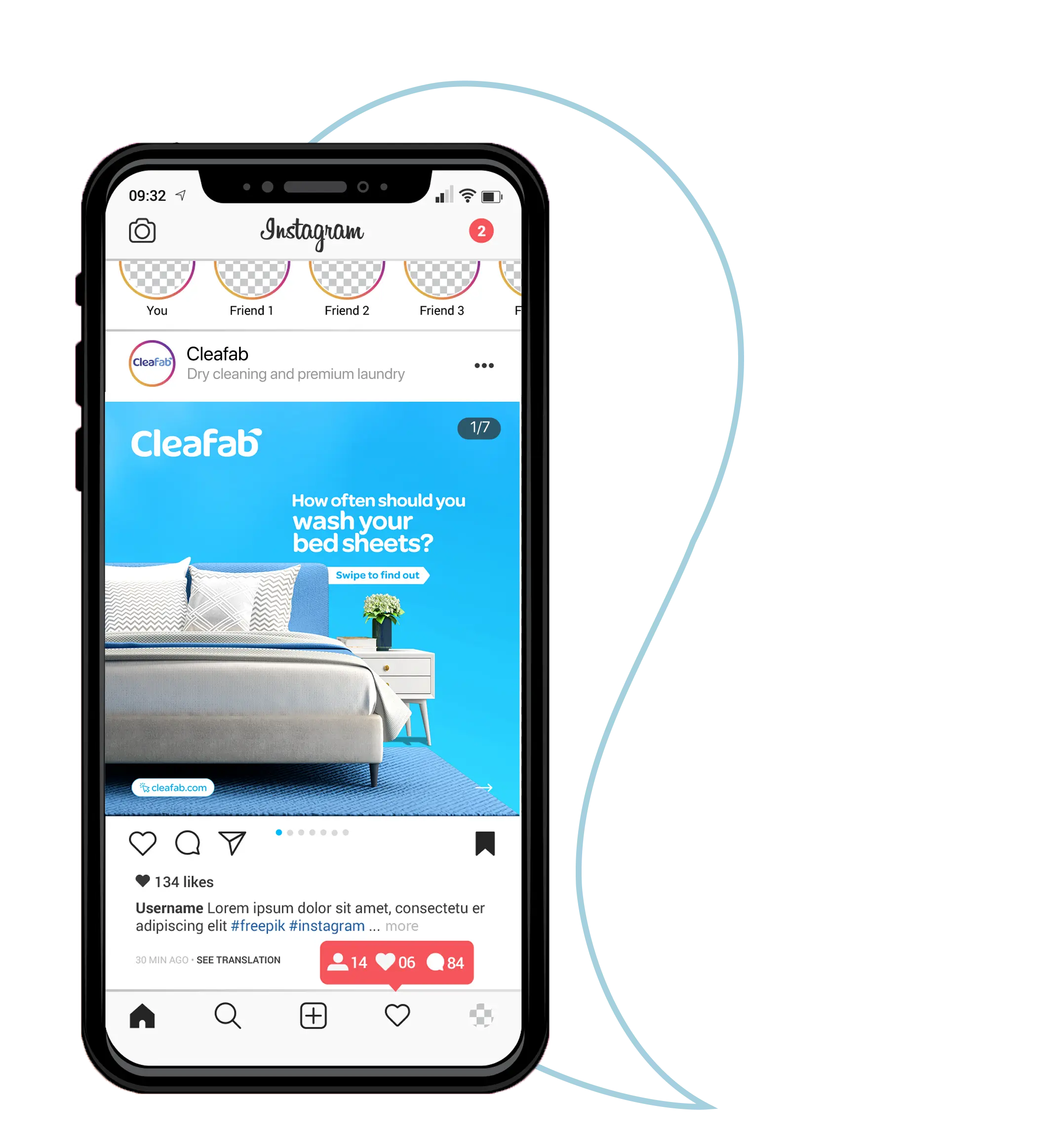
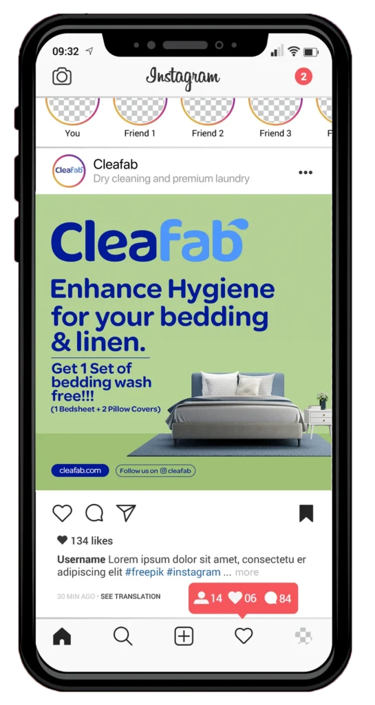
Social Media
Showcase