The project focuses on building a unified and playful packaging identity for FreshCon by developing a visual language that stays consistent across all product types. Each category like frozen and ready-to-cook was given distinct colours and cues while retaining core brand elements like the curved shape, clock icon, and vibrant tone. Interactive elements such as step-by-step line illustrations and fun callouts were added to make the packaging more engaging, clear, and true to FreshCon’s friendly, time-saving promise
Our Contribution
Visual Identity Brand Strategy Packaging Design Branded Merchandise Social Media
In today’s fast-paced world, time in the kitchen is no longer a luxury,
but the craving for wholesome, home- cooked meals hasn’t gone away
The Positioning Opportunity
Ready-to-cook and semi-prepared ingredients are becoming an essential part of modern kitchens. With changing lifestyles and increasing demand for convenience, this segment is evolving rapidly and showing strong promise—especially in India. As more consumers look for time-saving yet wholesome cooking solutions, there’s a growing opportunity to build a brand that brings freshness, relatability, and strong identity to this space.
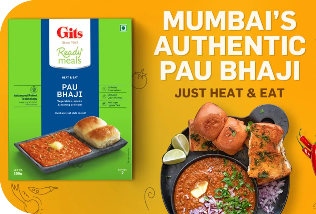
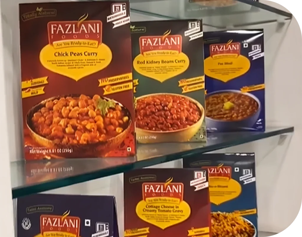
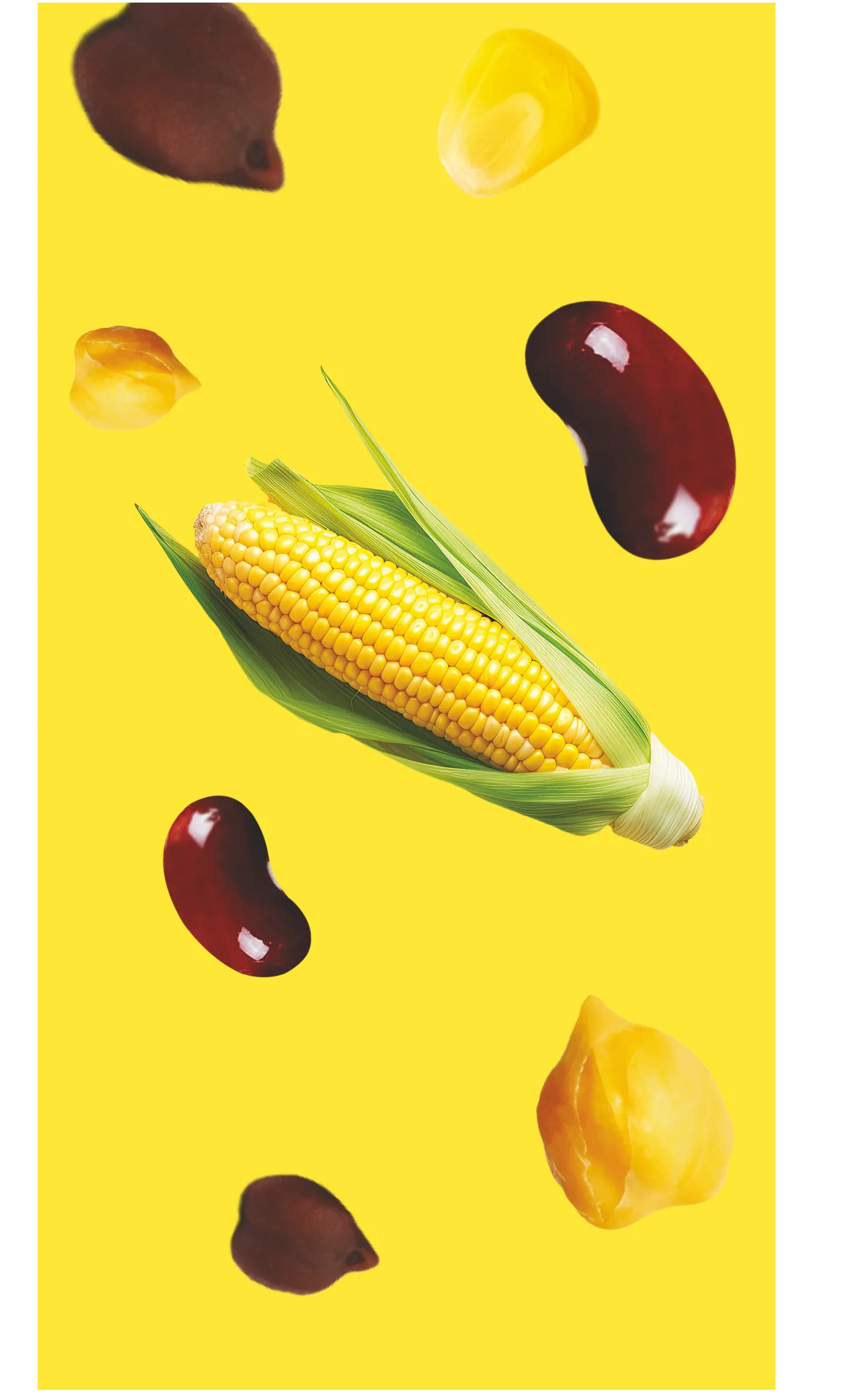
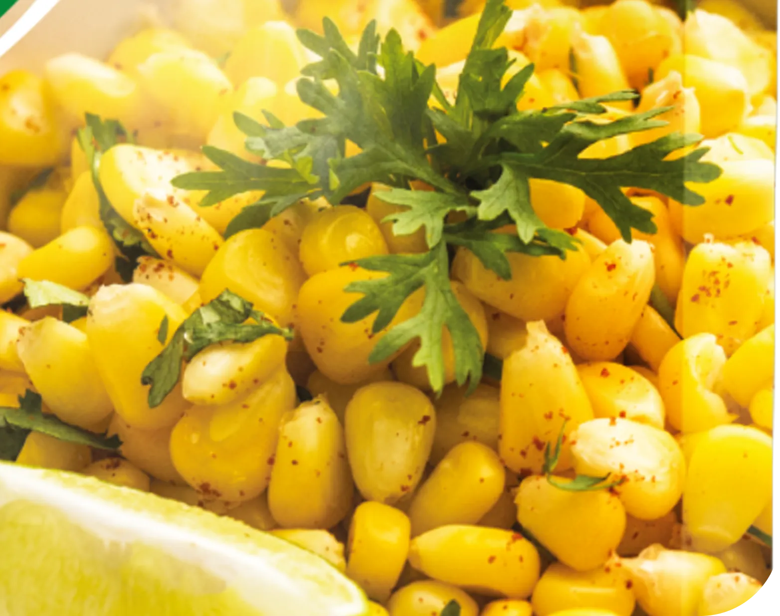
Ready to eat sweet corn items
Ready to cook curries and sabjis
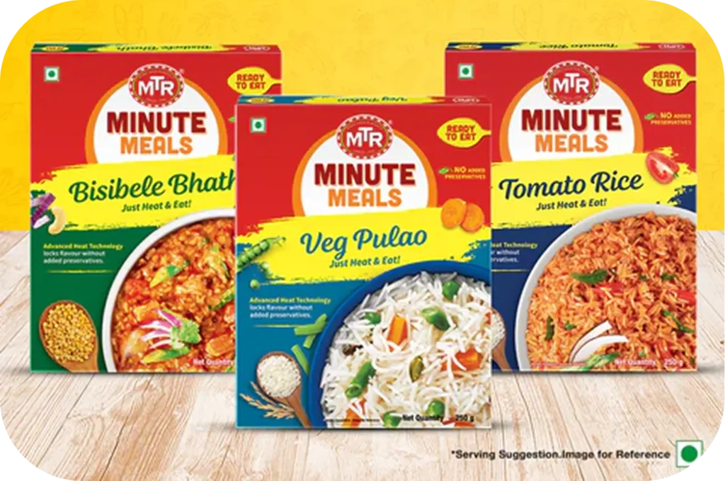
Ready to cook rice
The demand was clear. The potential was real. The ingredients were all there—freshness, convenience, and relevance. All it needed was a brand that could turn time-saving into something meaningful, with the right packaging and personality to bring it all together.
A Soulful Blend Of Freshness and Convenience
A Soulful Blend Of Freshness and Convenience
About FreshCon
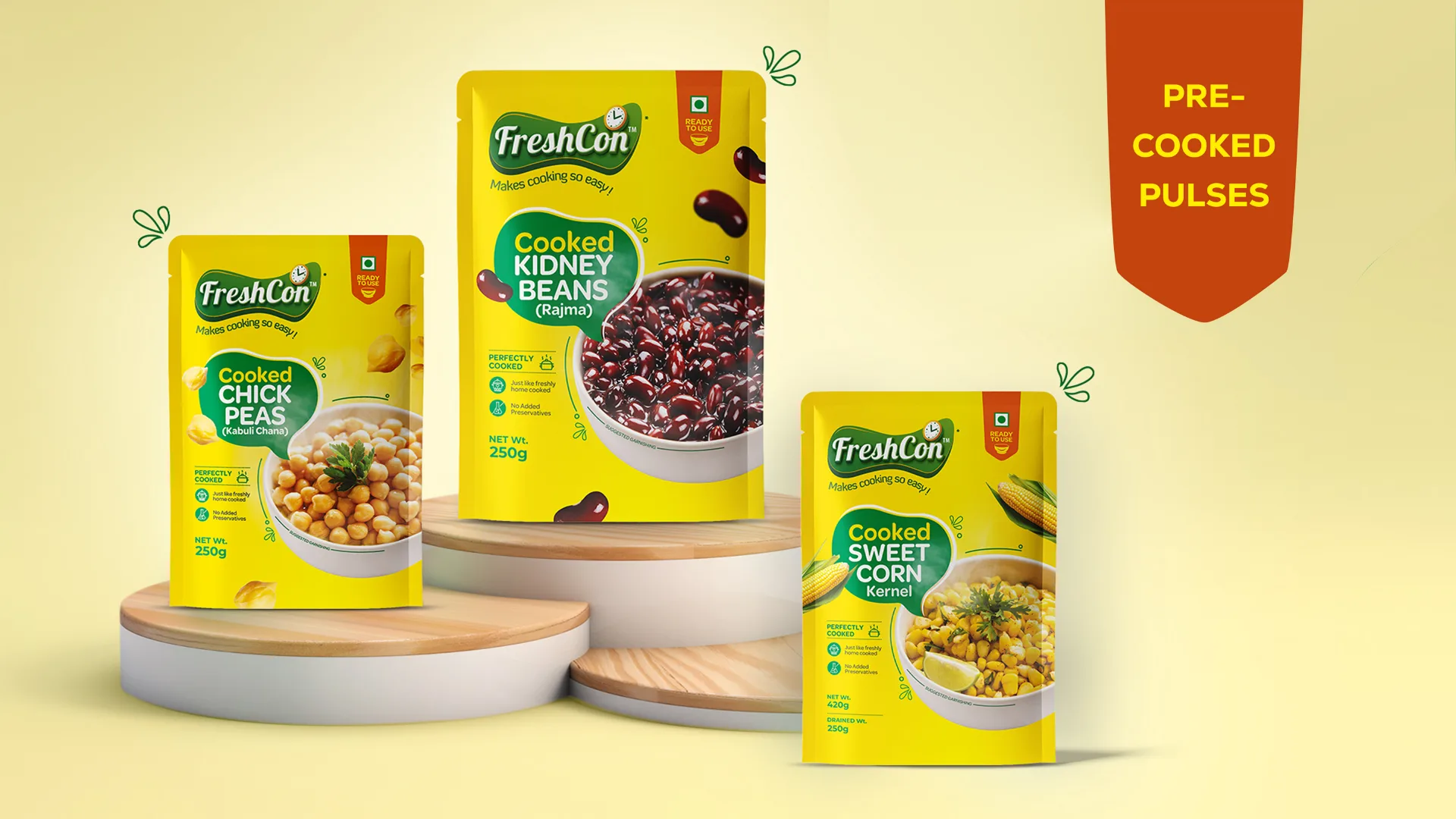
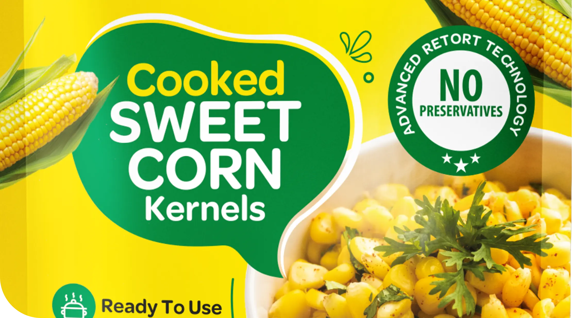
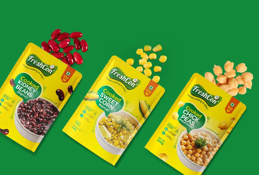
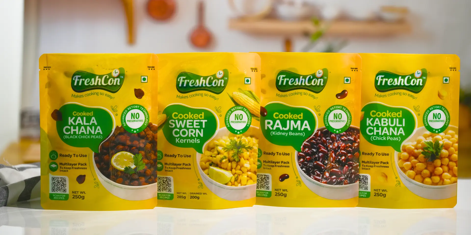
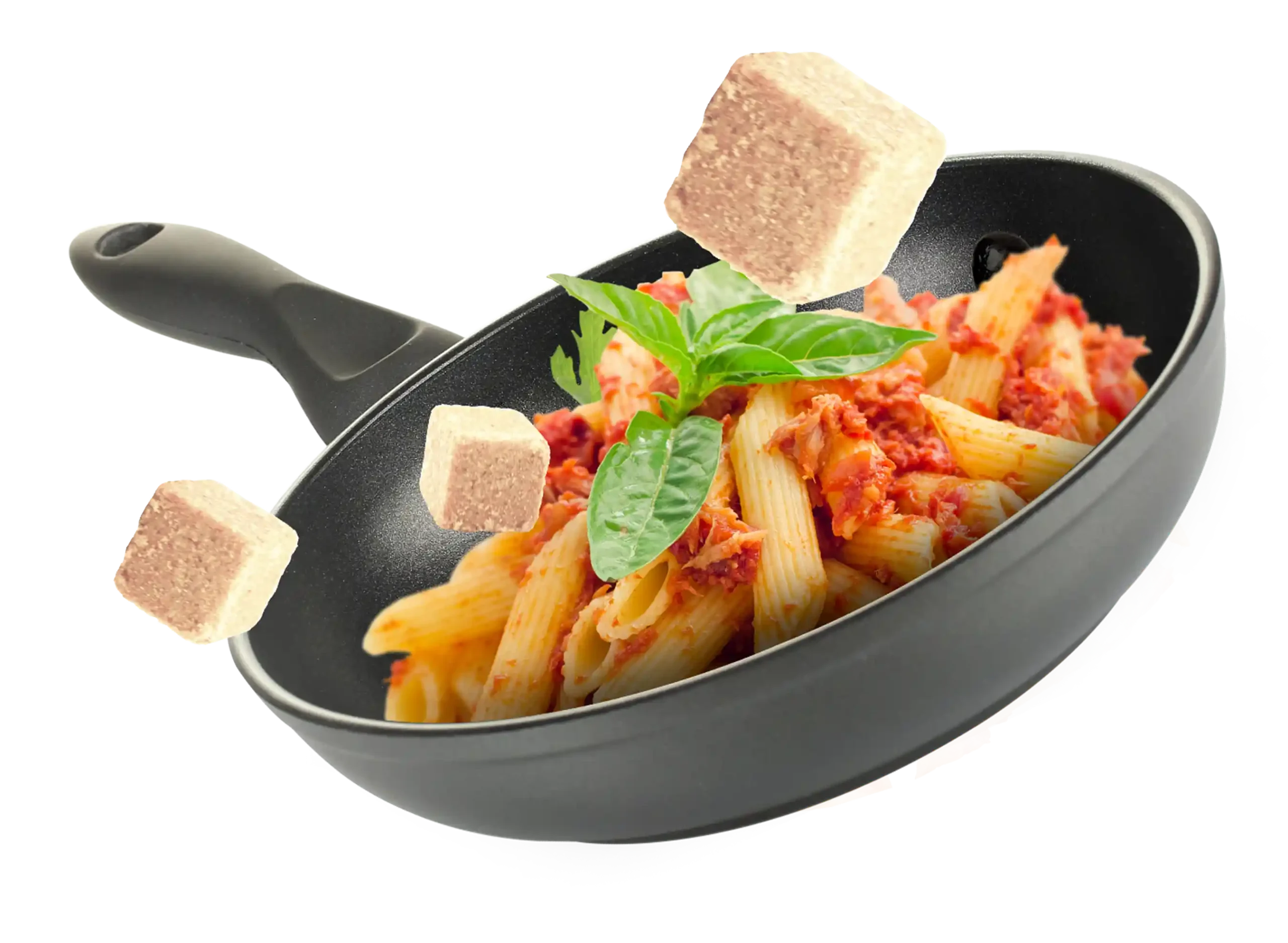
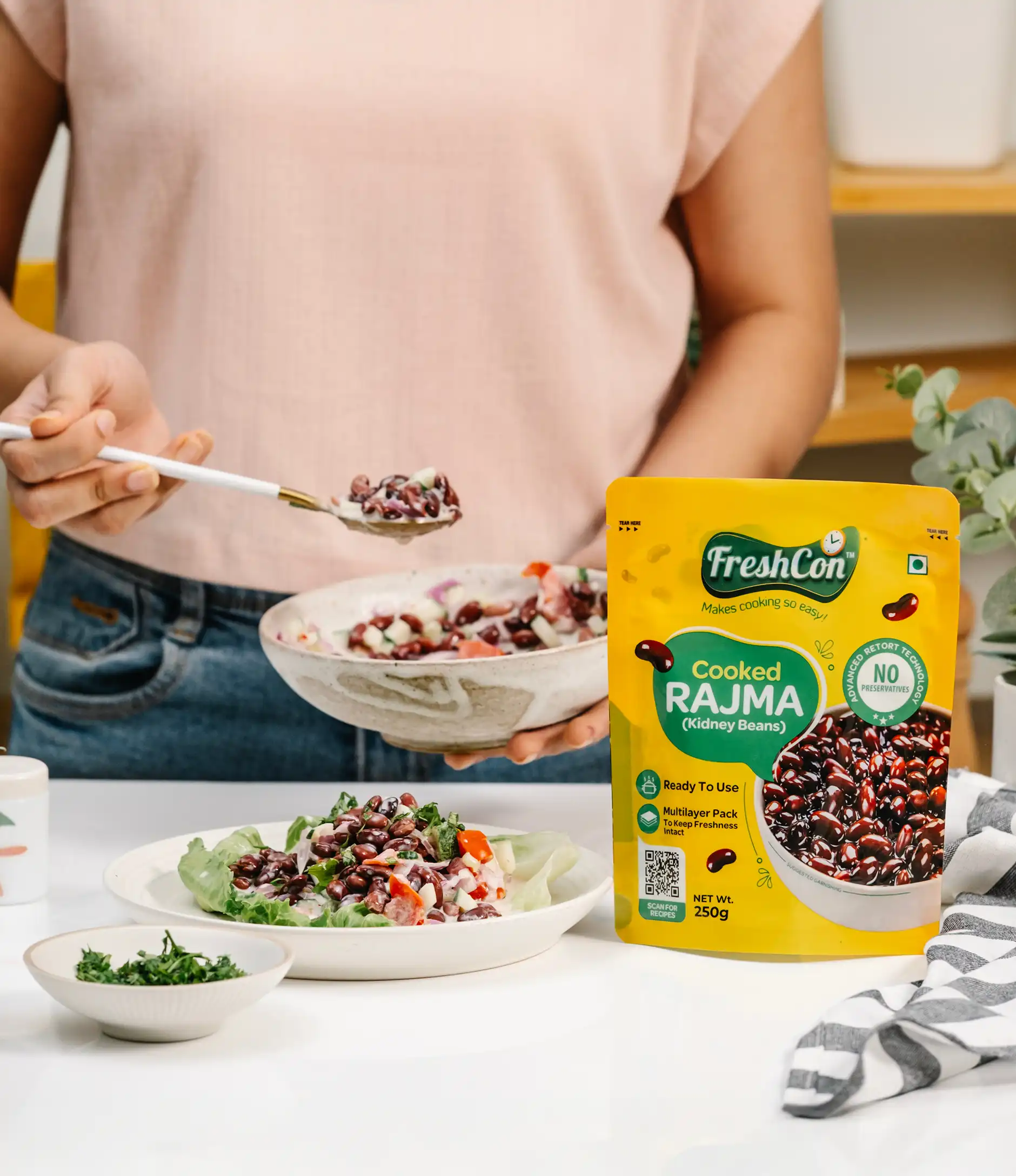
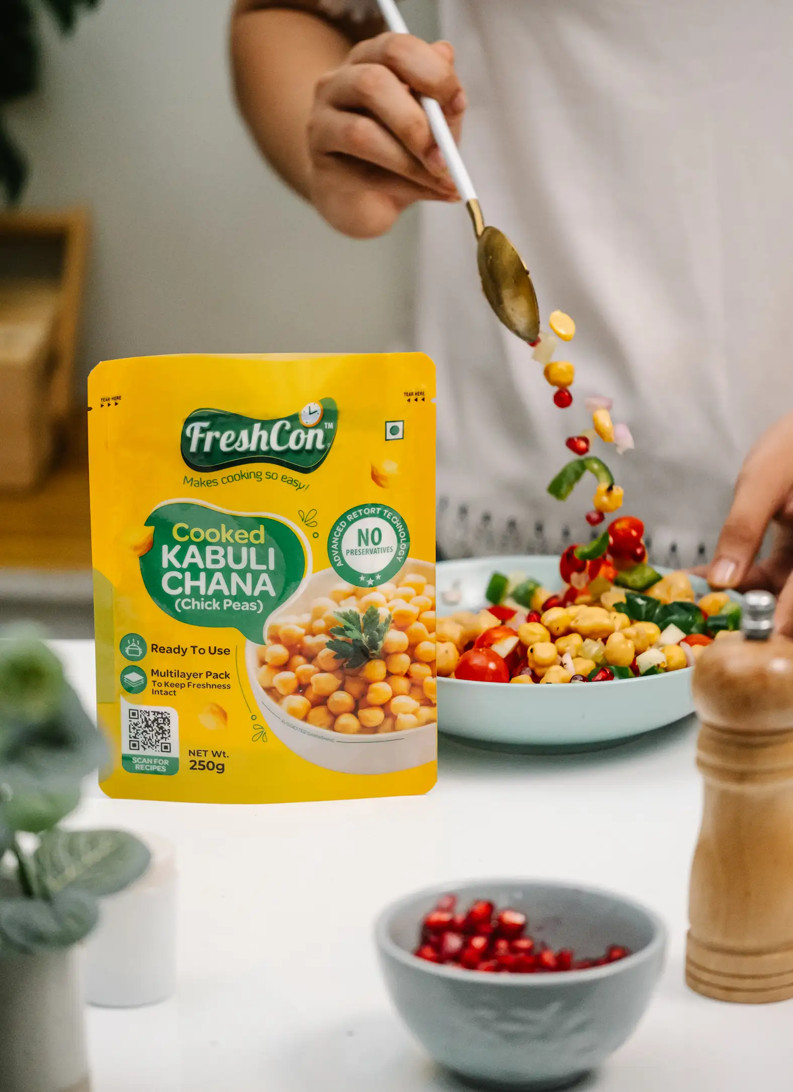
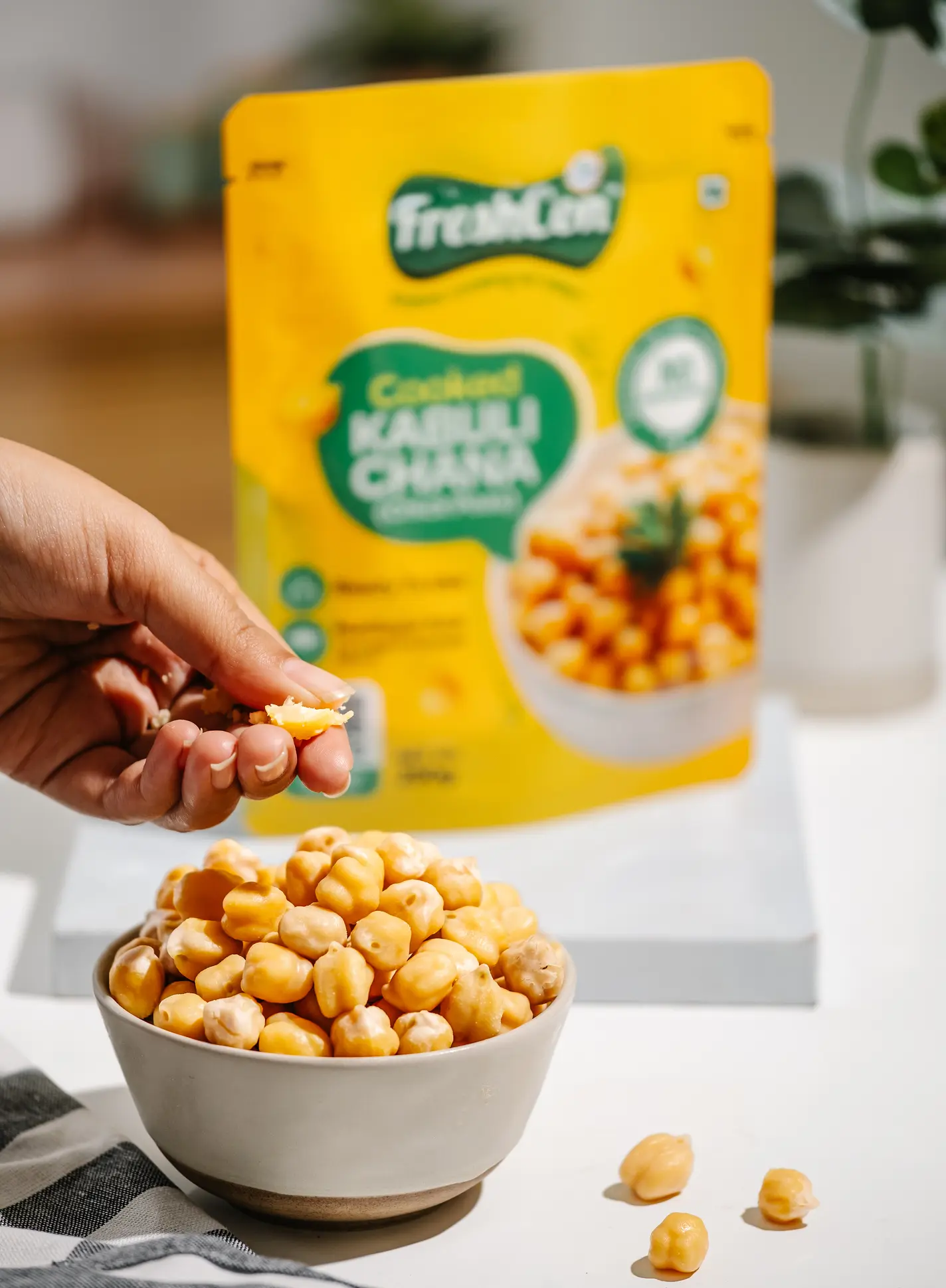
FreshCon is a smart, convenience-led food brand transforming the way people cook with its range of pre-cooked, preservative-free ingredients like rajma, kala chana, sweet corn, and frozen essentials such as garlic and chili cubes. What makes FreshCon unique is its commitment to offering natural, ready-to-use products that save time without compromising on nutrition or taste—no soaking, boiling, or chopping needed. With a vision to simplify cooking for every household and a mission to deliver freshness, health, and ease through innovation, FreshCon is redefining everyday meals by making real, wholesome food more accessible, efficient, and enjoyable.
India’s 1st Pre Cooked Ingredient Range
FreshCon has chosen to focus on the emerging niche of ready-to-cook ingredients—offering convenience without taking away the joy of home cooking.
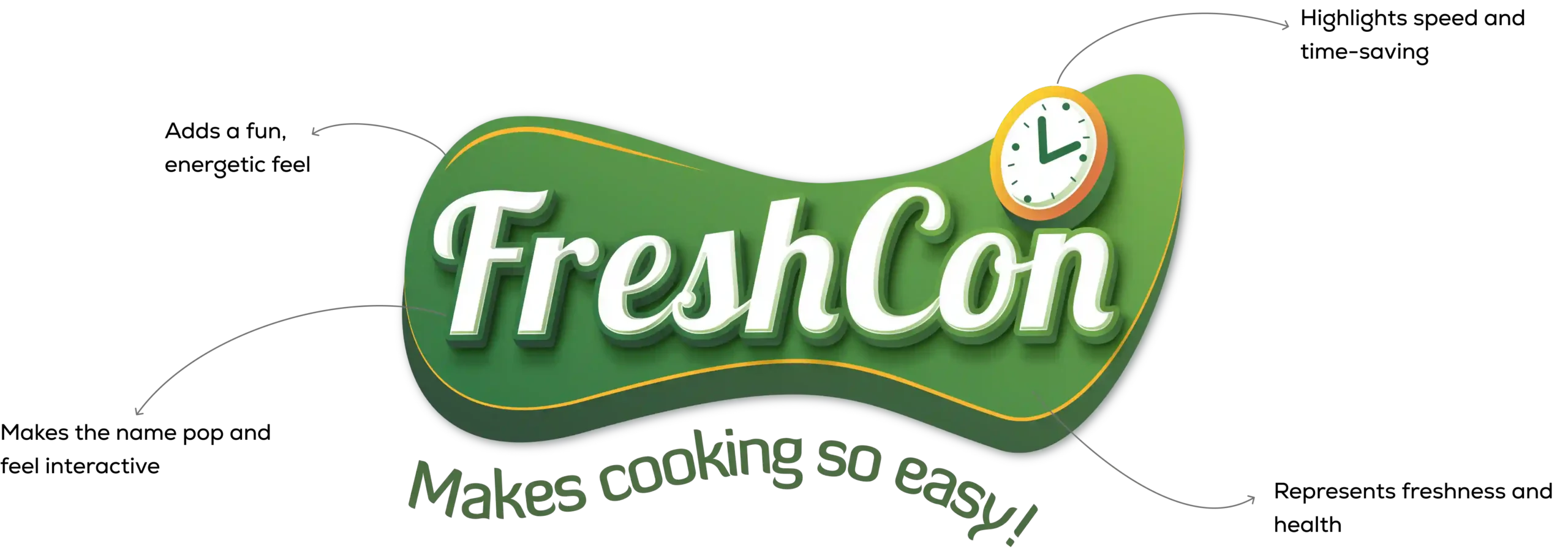
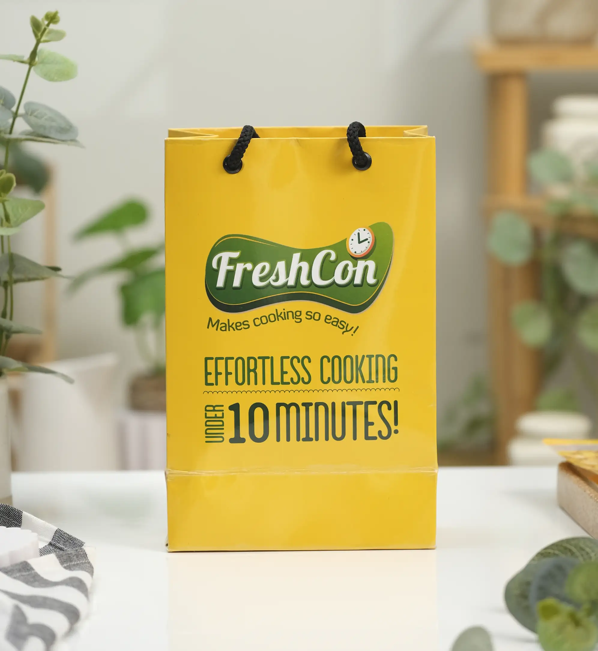
Translating the FreshCon Logo into Packaging Language
Deriving the Design Elements
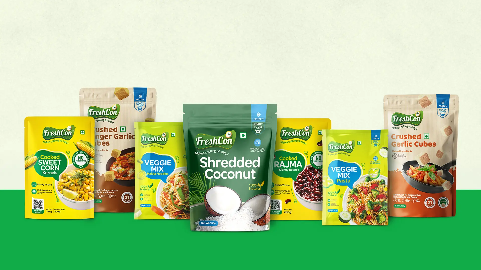
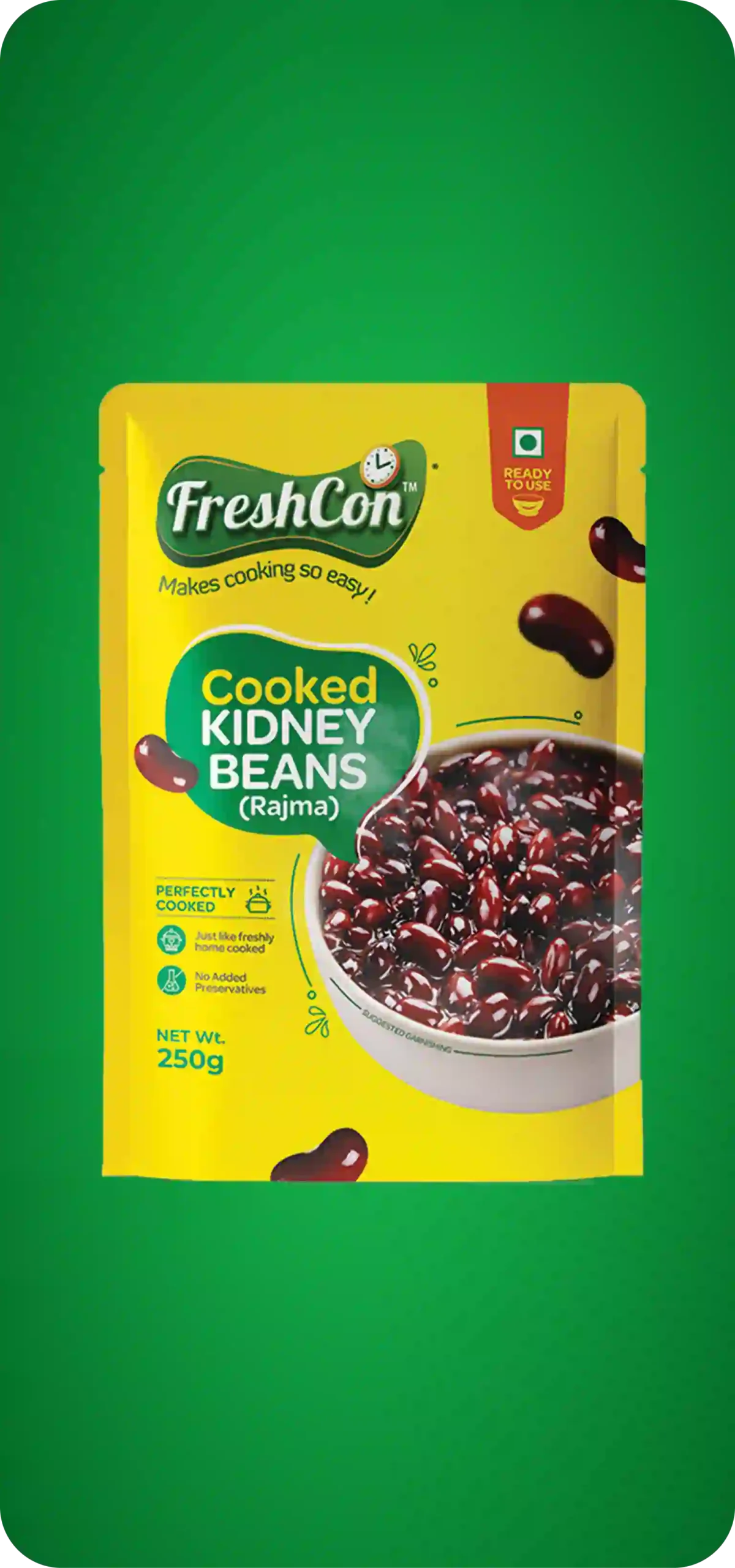
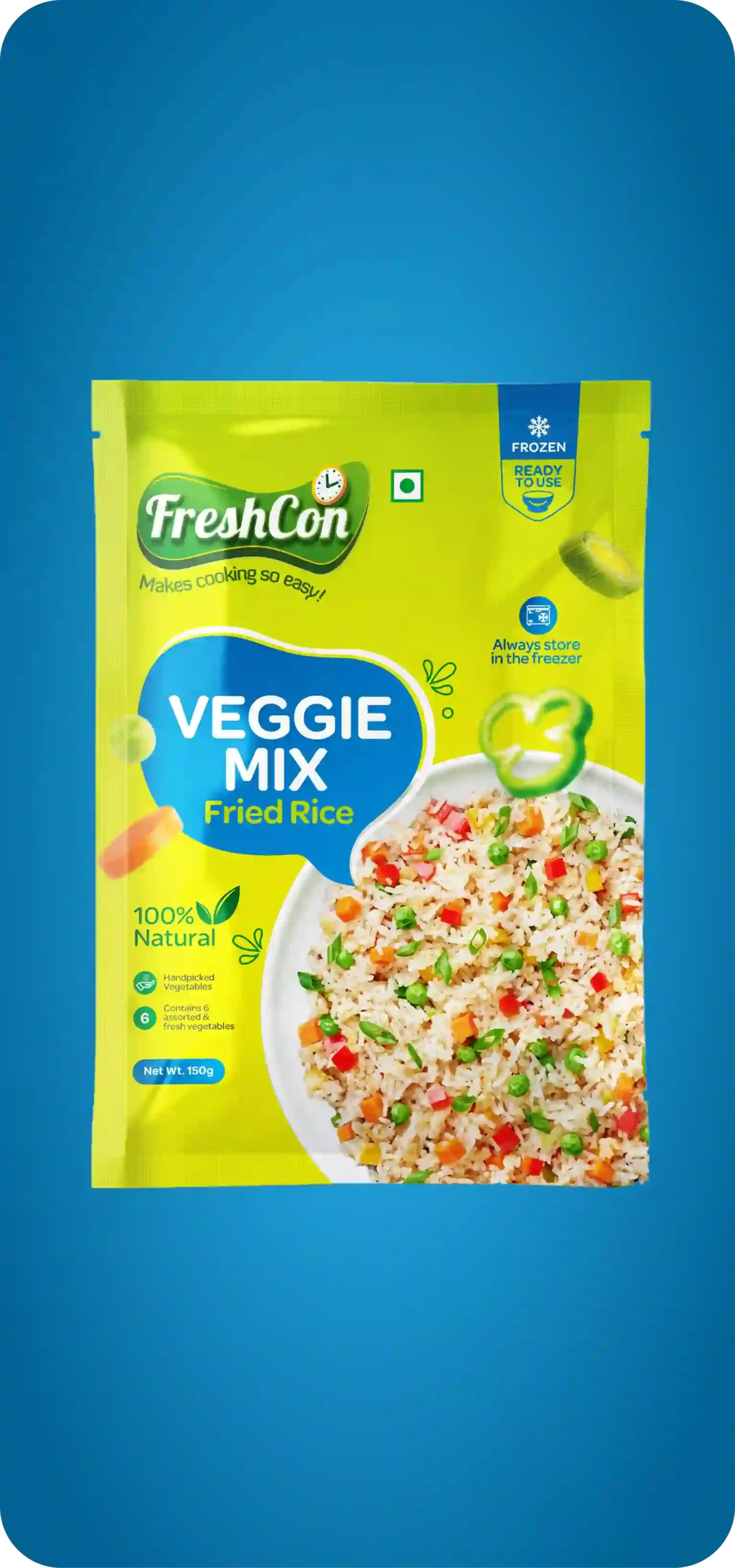
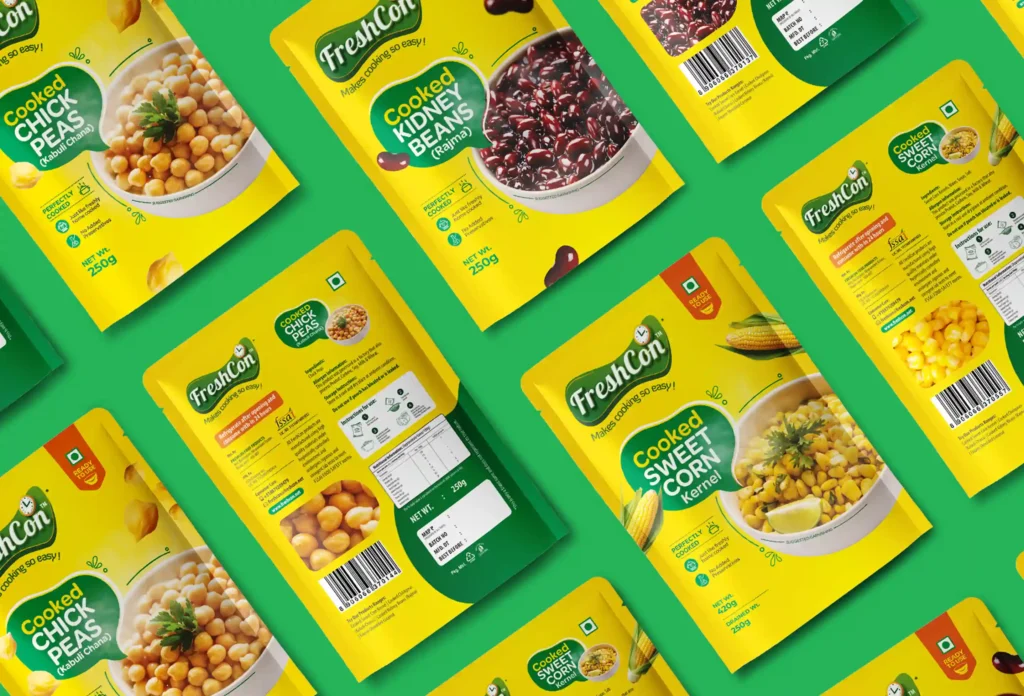
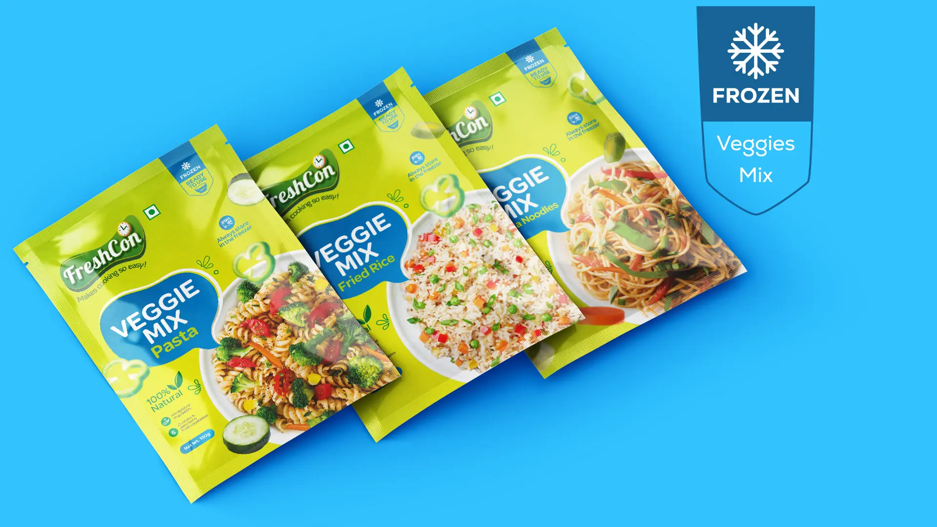
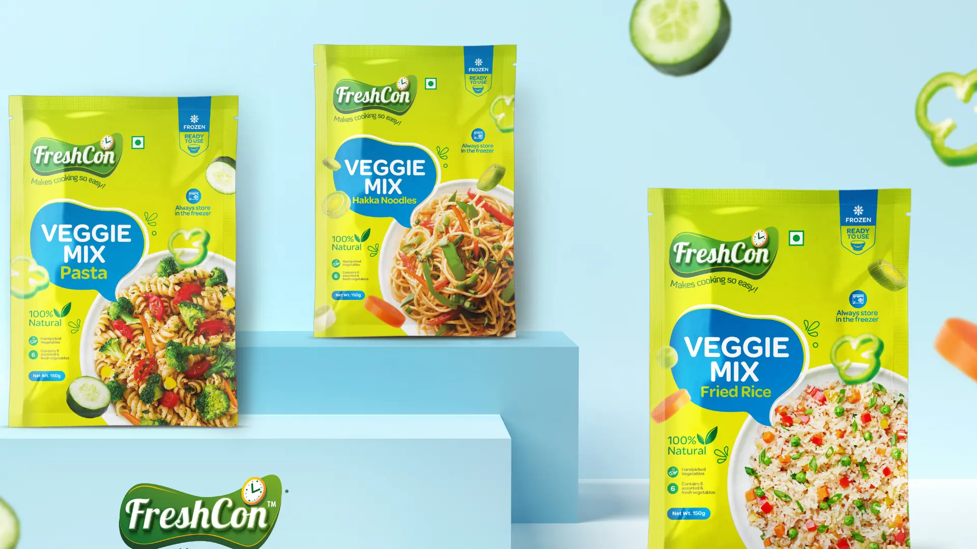
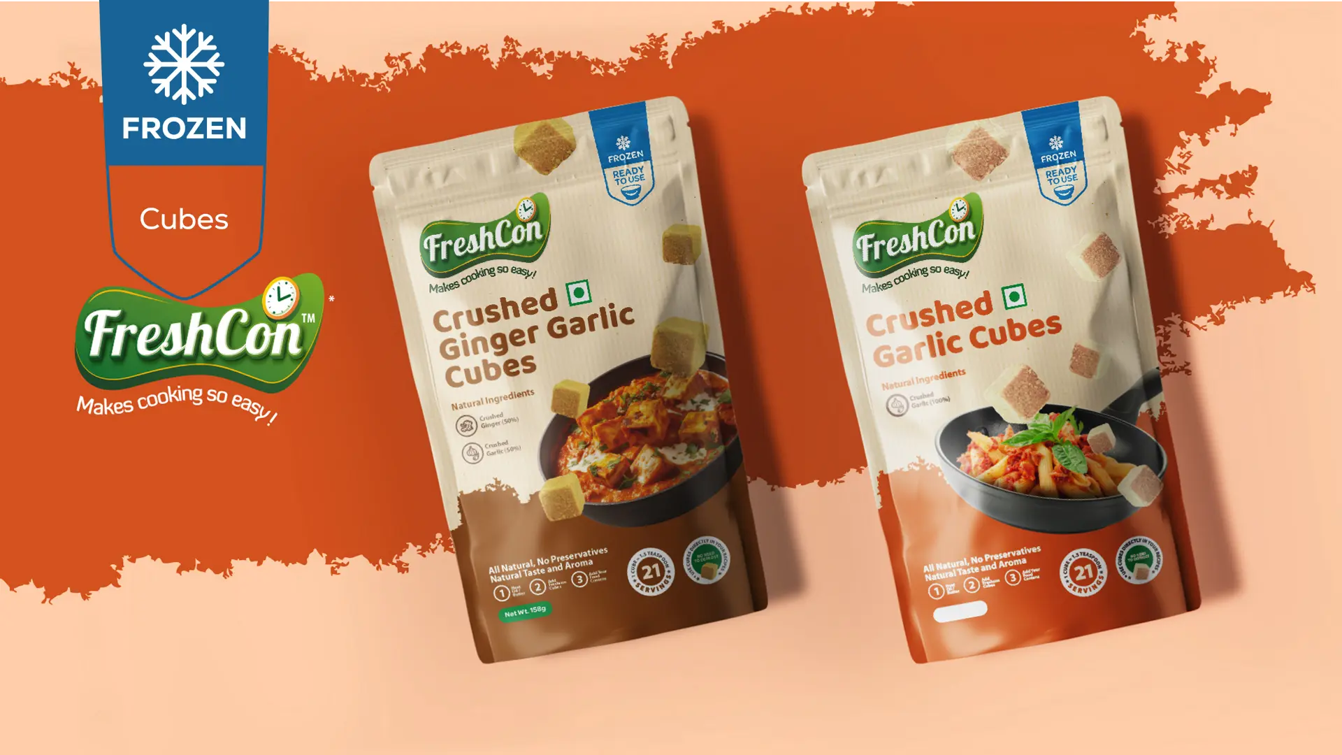
Product Categories
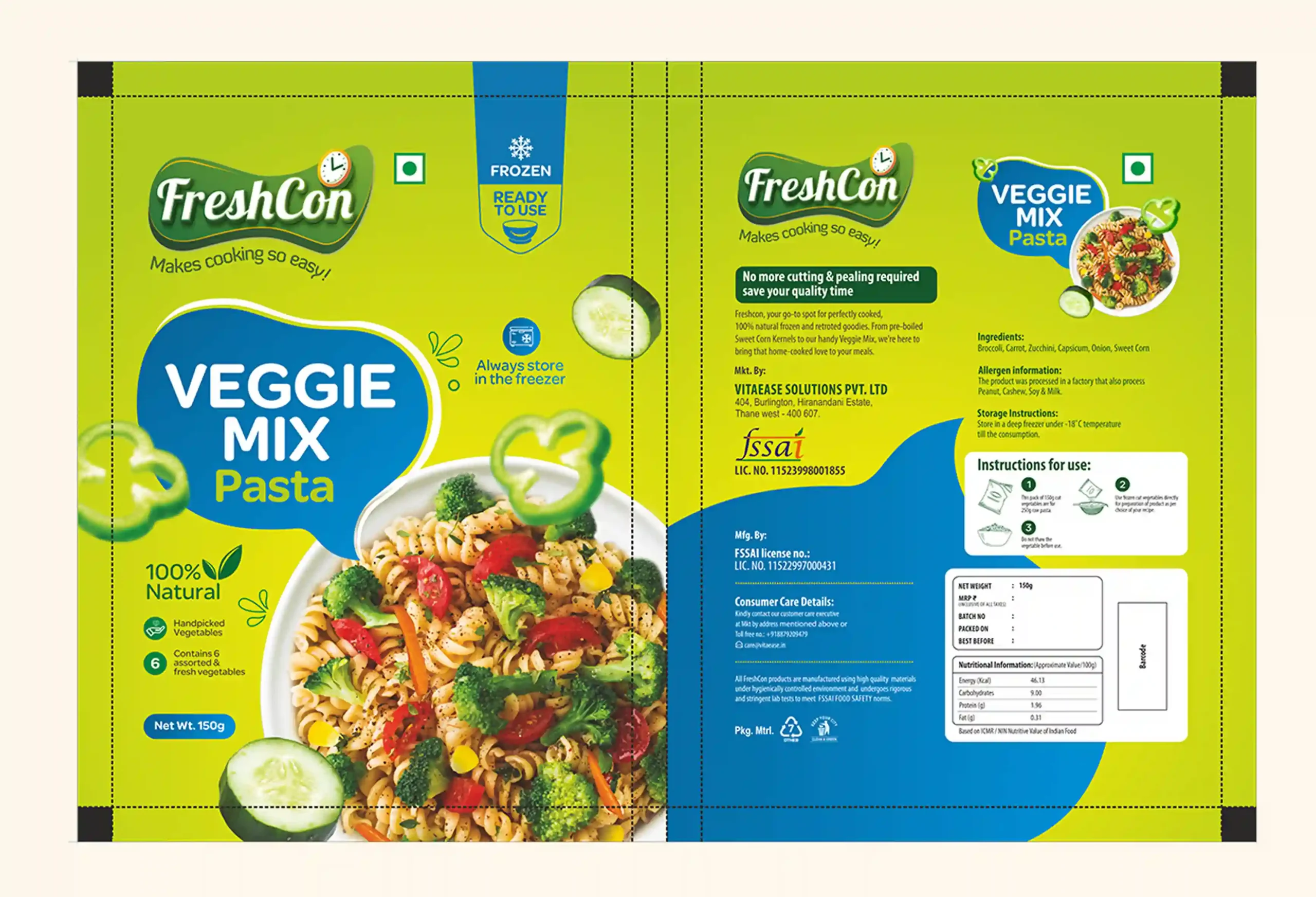
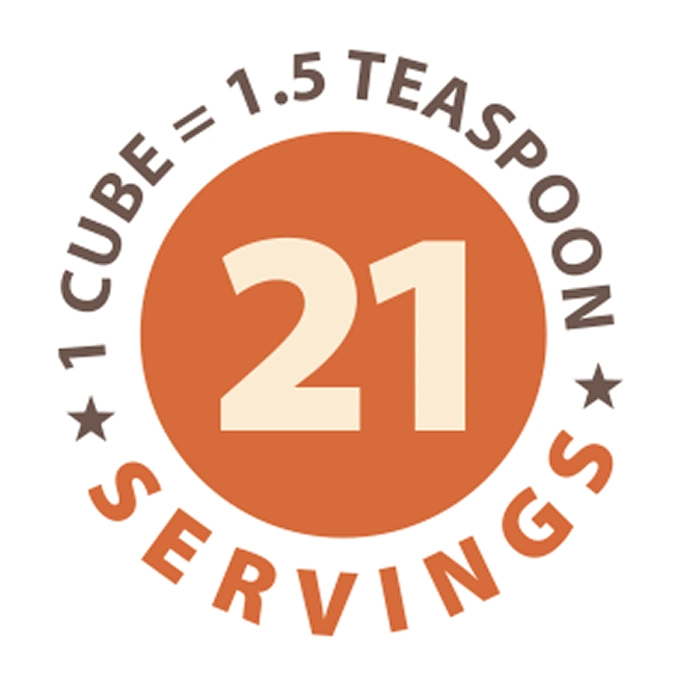
What Goes on the Pack
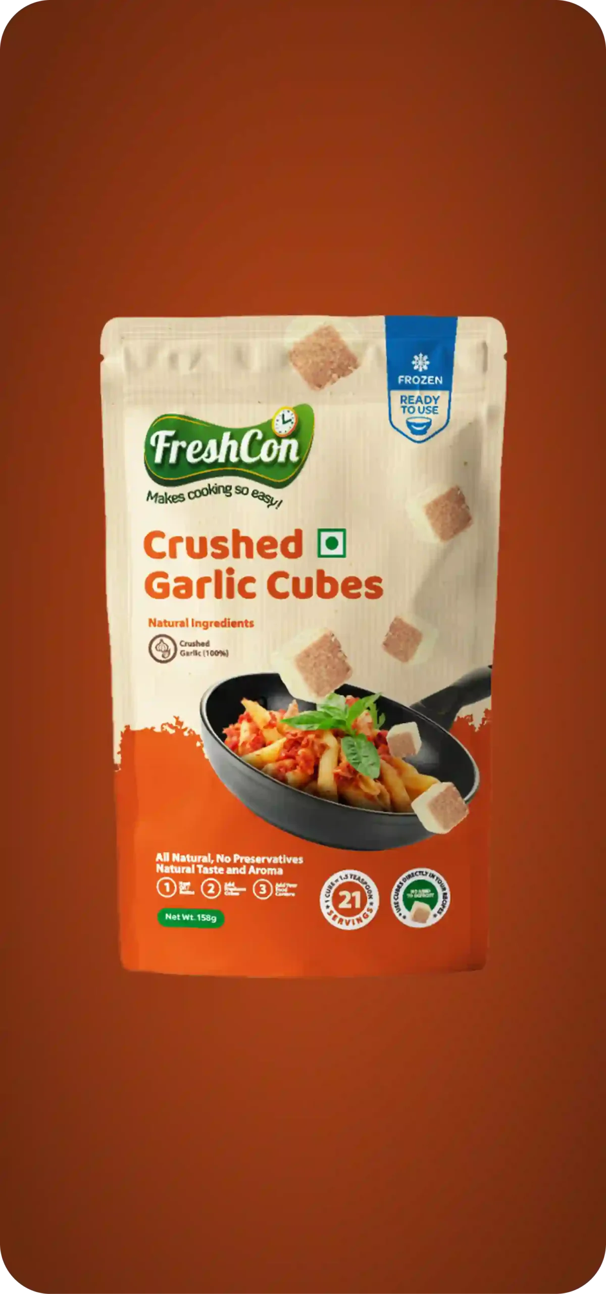
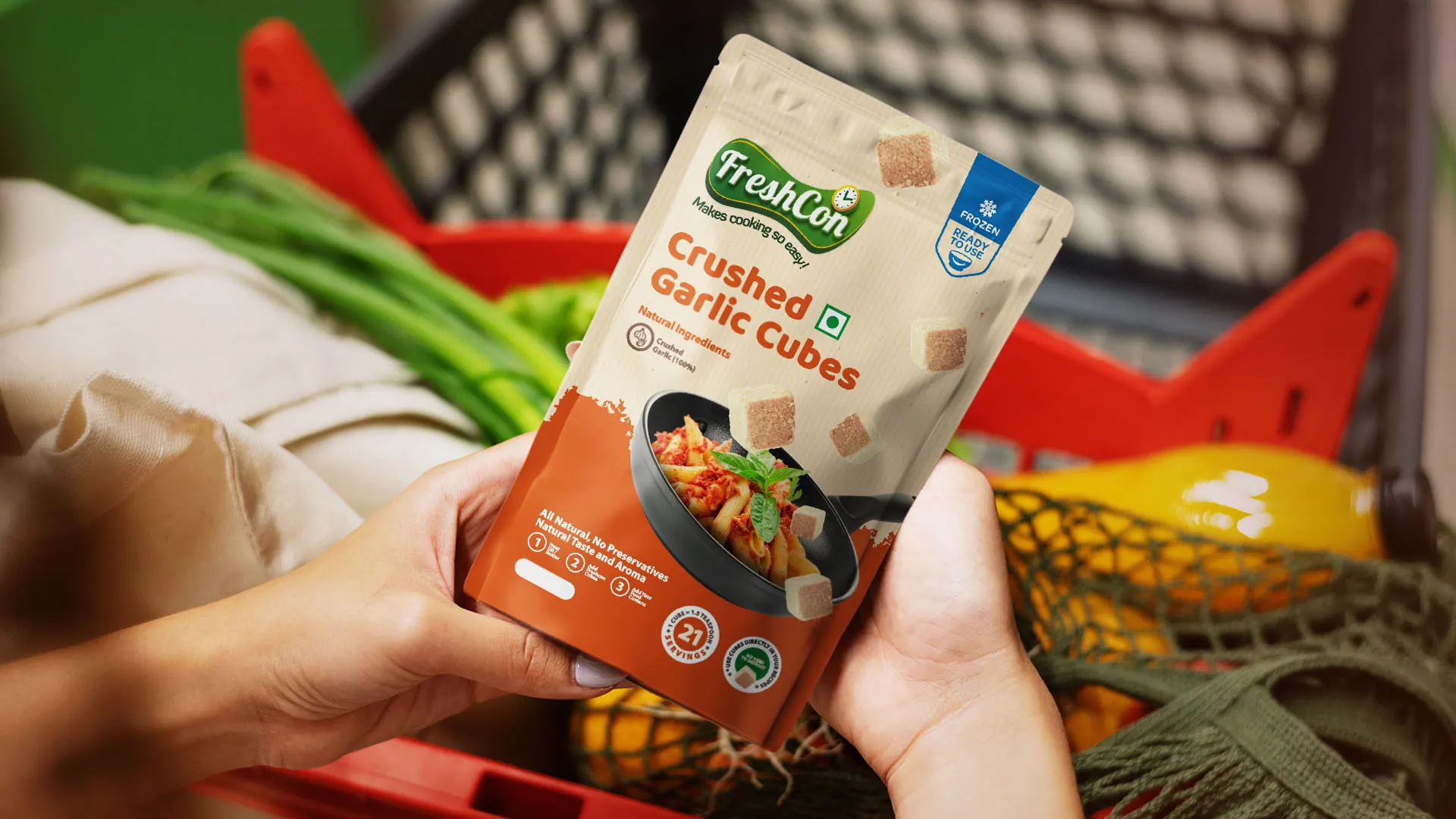
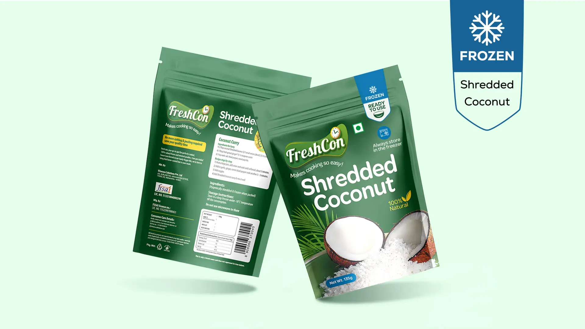
The color palette shifts to green and blue to clearly differentiate this as part of the frozen category—blue symbolizing chill and freshness, while green continues to reinforce naturalness and health
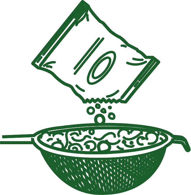
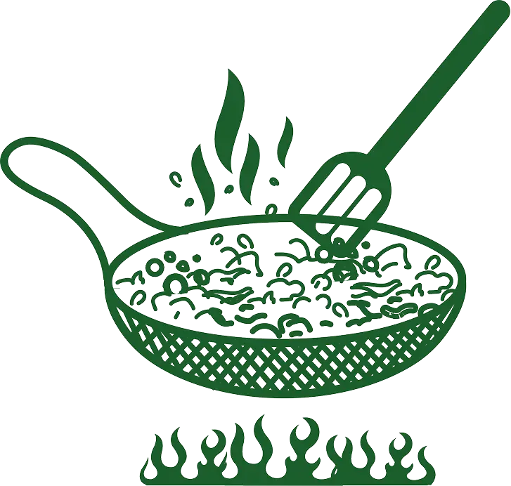
Simple Illustrations That Speak for Themselves
These clean, minimal line art illustrations visually explain the cooking process in a simple, self-explanatory way matching FreshCon’s easy, friendly, and no-fuss brand style.
A Taste Through the Lens
Unlock the potential of your ideas! 🚀
We're offering a Complimentary Brainstorming Session to bring your vision to life.