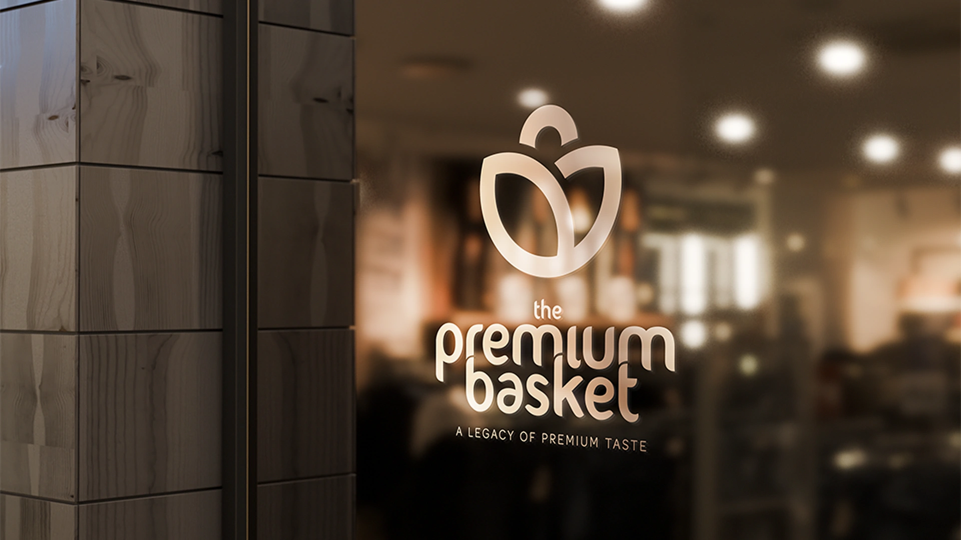
Premium Basket, known for its legacy in high-quality dry fruits, needed a fresh packaging direction for its online launch—one that preserved its premium essence while standing out in the digital space. We crafted a clear, categorized packaging system that blends transparency with real fruit imagery, catchy phrases, and a refined color palette combining joyous tones with elegance. This new visual language not only enhances shelf appeal but also repositions dry fruits as precious daily indulgences. By thoughtfully redesigning the packaging and brand strategy, we gave Premium Basket a distinctive, modern edge—one that honors its heritage while embracing a vibrant, future-ready identity.
Our contribution
Visual Identity Brand Strategy Packaging Design Illustration system Social Media Spatial Graphics
The Premium Basket: Rooted in Legacy
The Premium Basket began with Mr. Gulamabbas Bata’s belief in offering only the finest dry fruits—sourced with care, selected with expertise, and shared with pride. From a humble storefront in Mumbai, it became a trusted name built on purity, quality, and tradition for over 40 years—all without a defined visual identity. Now led by Mr. Yusuf Bata and the next generation, the brand enters a new chapter. Our role was to translate this legacy into a cohesive design system across packaging, digital, and communication—honoring its roots while shaping a modern identity for today’s consumer.
This isn’t just a business—it’s our family’s legacy of trust and taste, now ready for the next generation.
Bridging Vision & Voice
In an early discussion with the team, they shared their vision of transforming their long-standing family legacy into a modern digital brand. With a desire to connect with a new generation of consumers, the idea was to create a fresh identity and launch The Premium Basket online—making their trusted, high-quality dry fruits accessible across India. Rooted in tradition but inspired by change, this marked a pivotal shift from a heritage business to a future-ready brand with a renewed sense of purpose.
Mapping the Market
Legacy
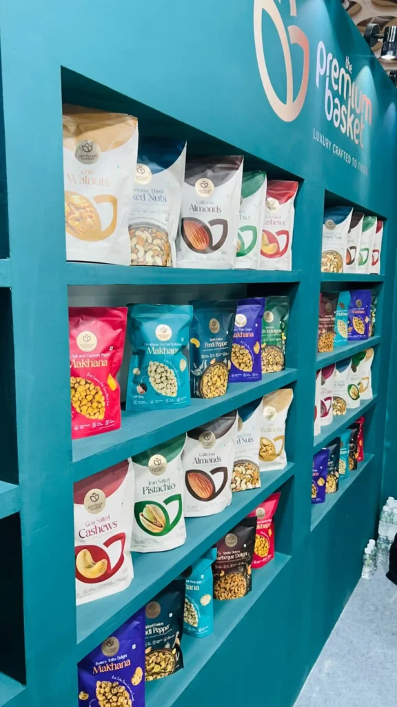
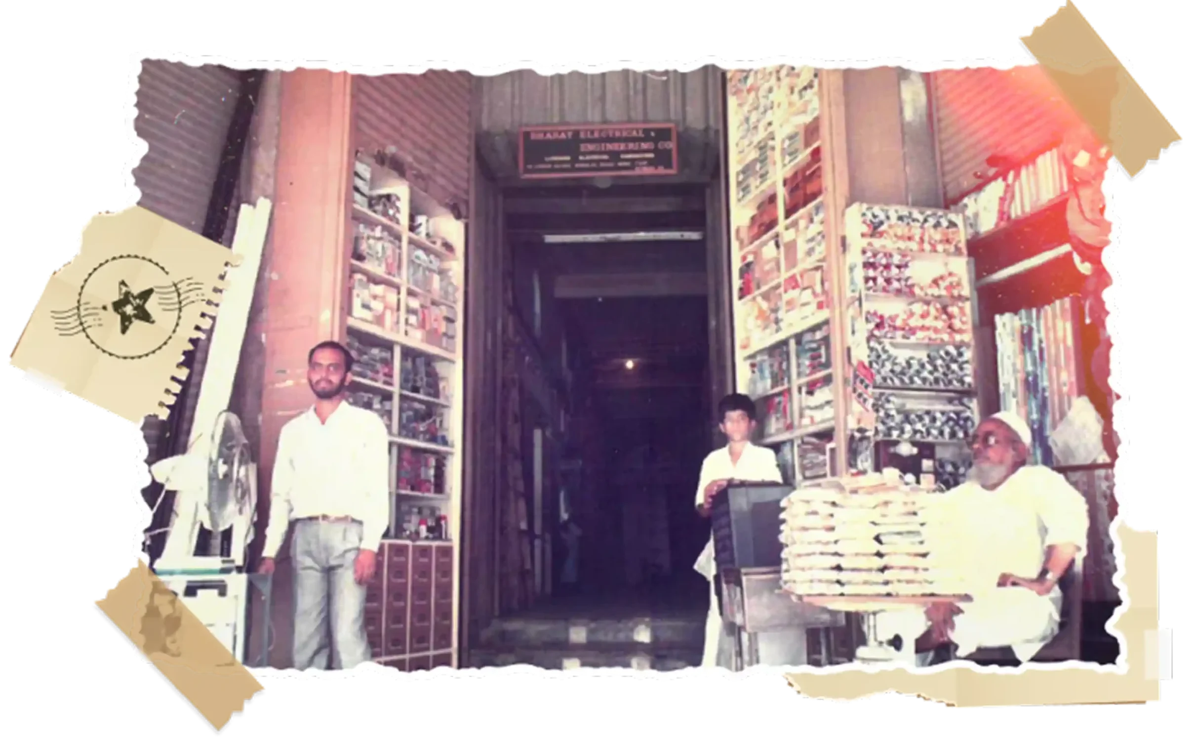
With decades of experience and a loyal customer base, Premium Basket carries a rich legacy of delivering honest quality and handpicked dry fruits. A brand shaped by heritage, care, and deep consumer relationships
Modern Relevance
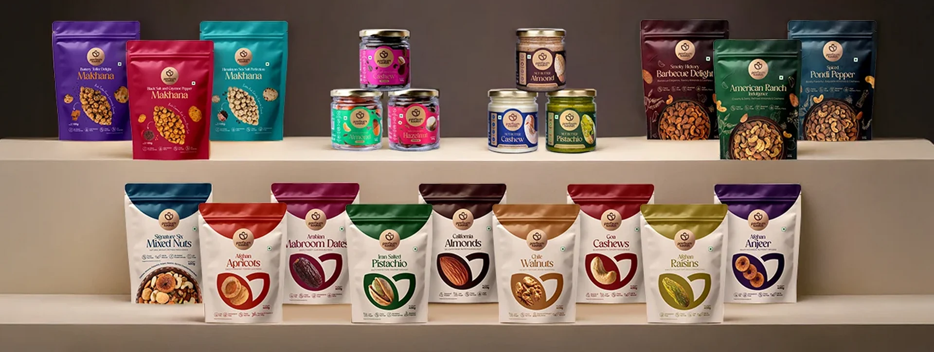
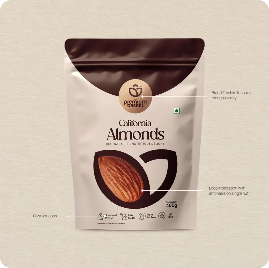
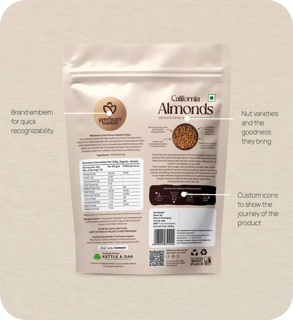
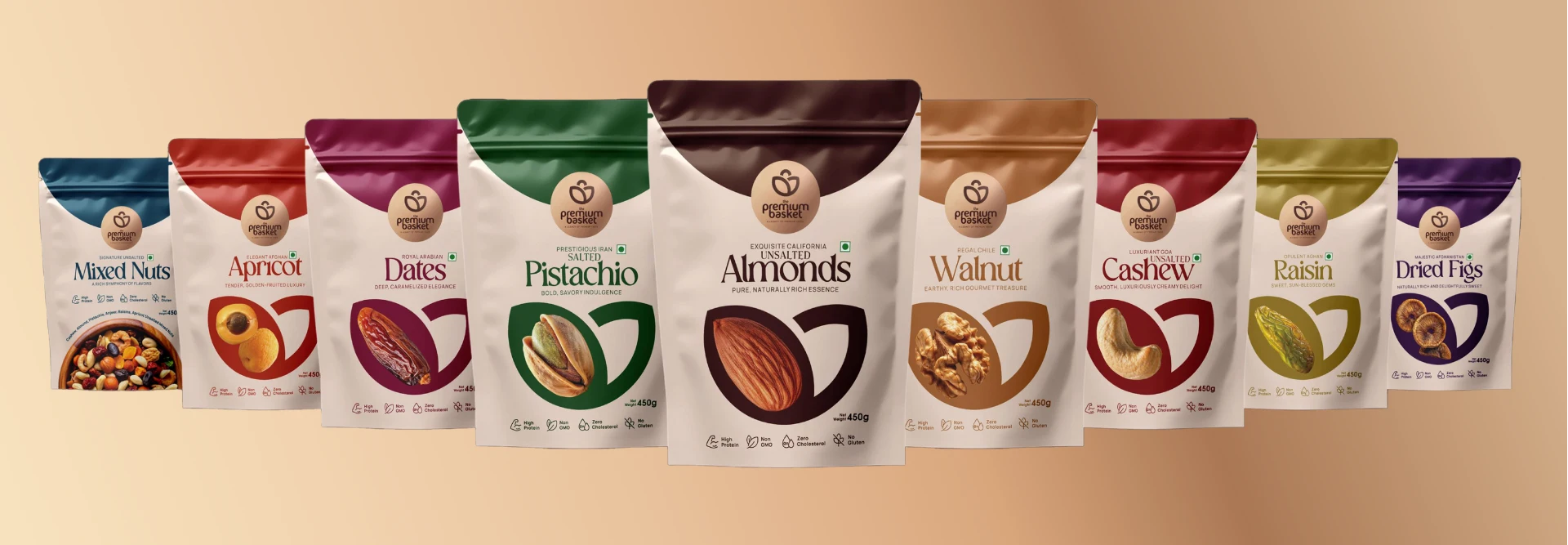
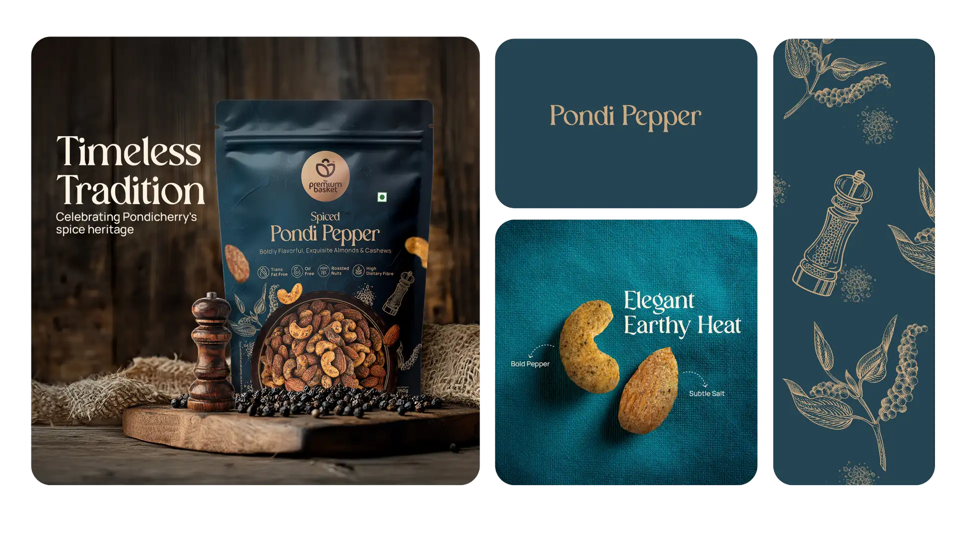
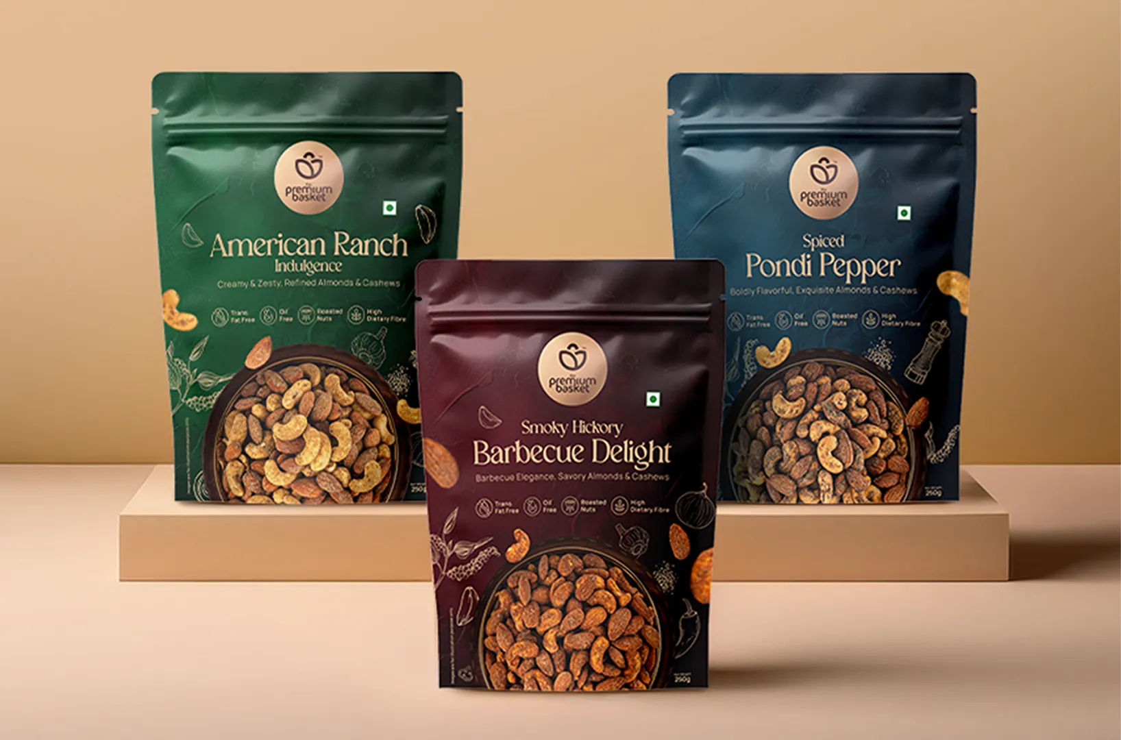
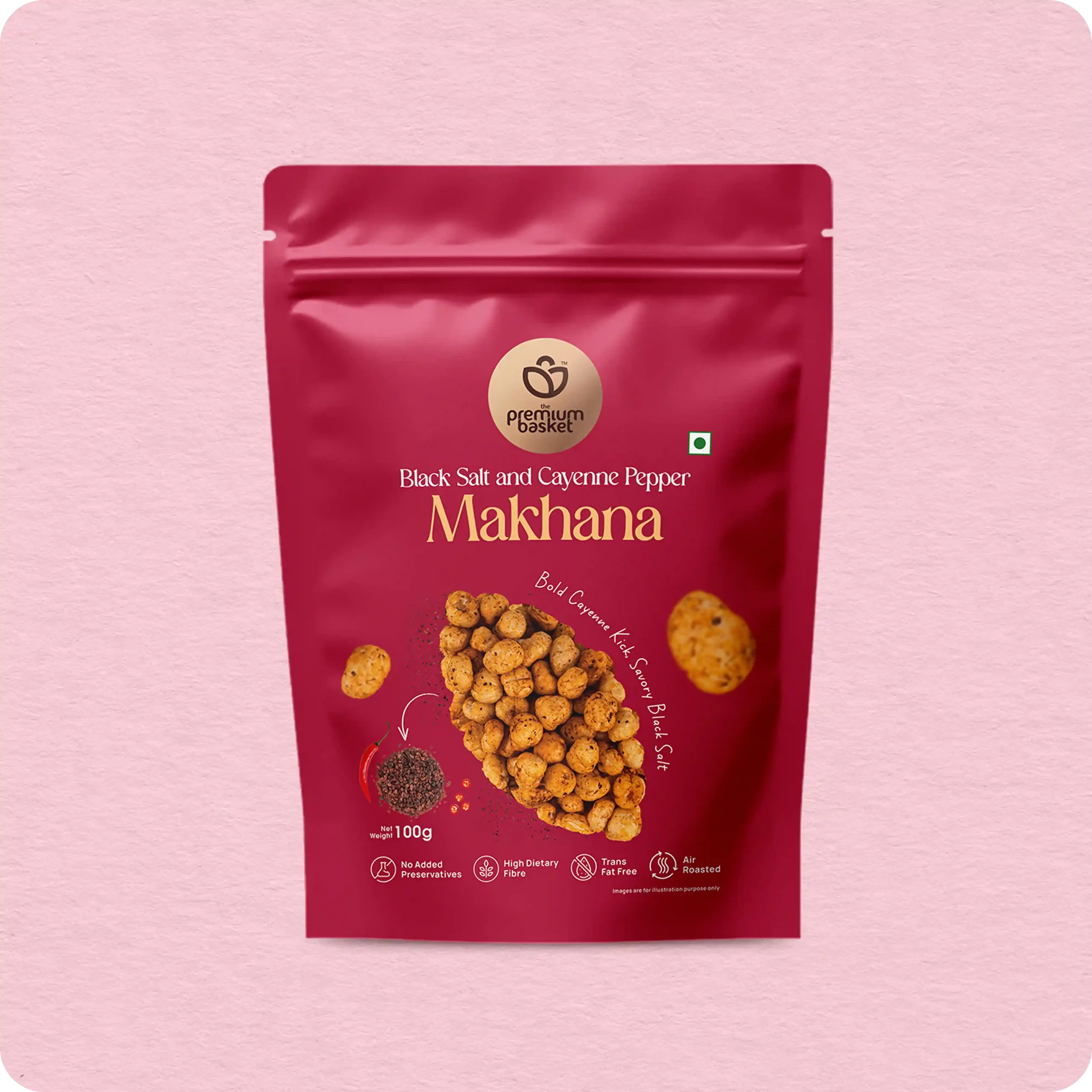
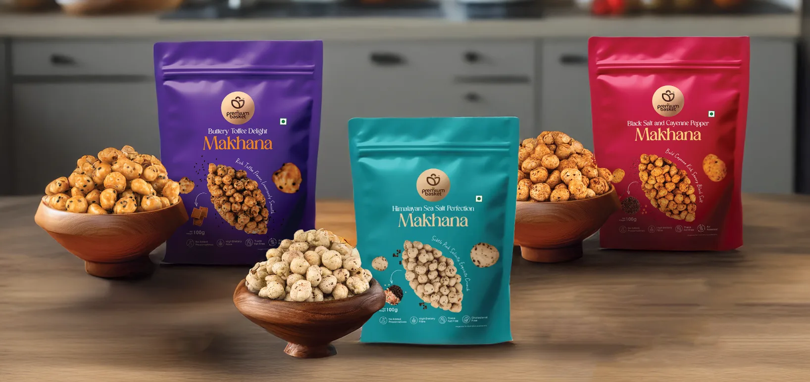
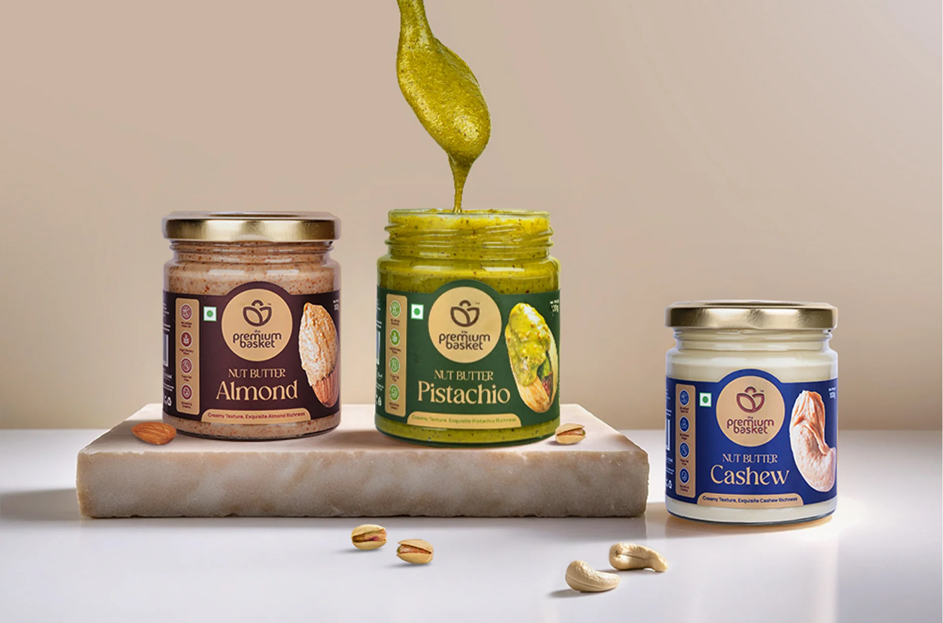
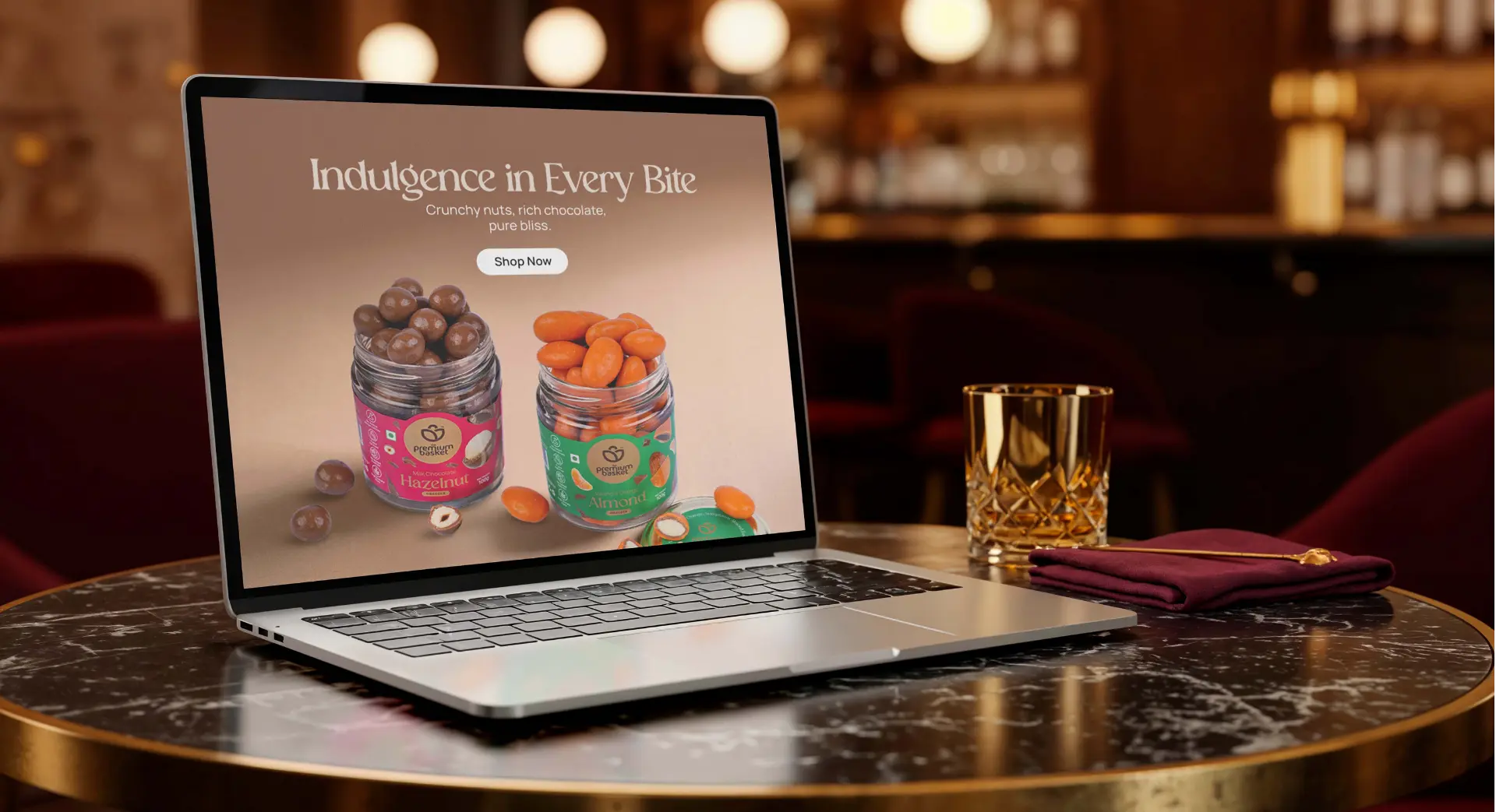
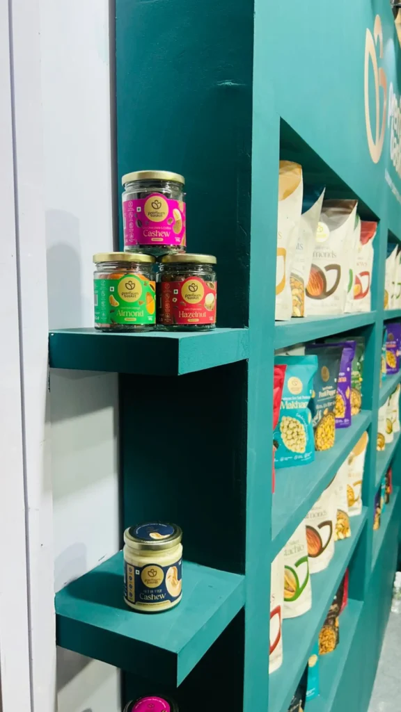
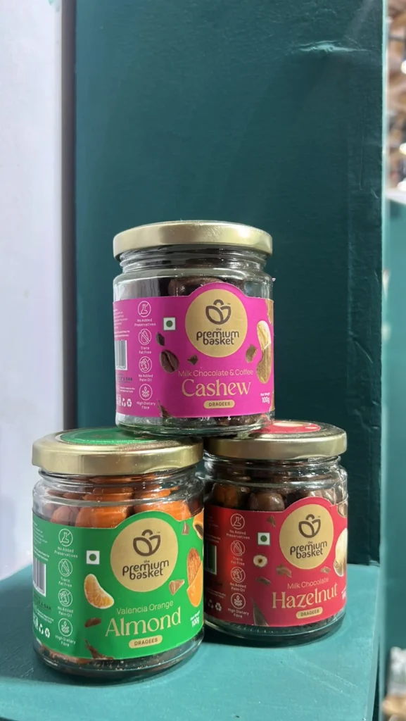
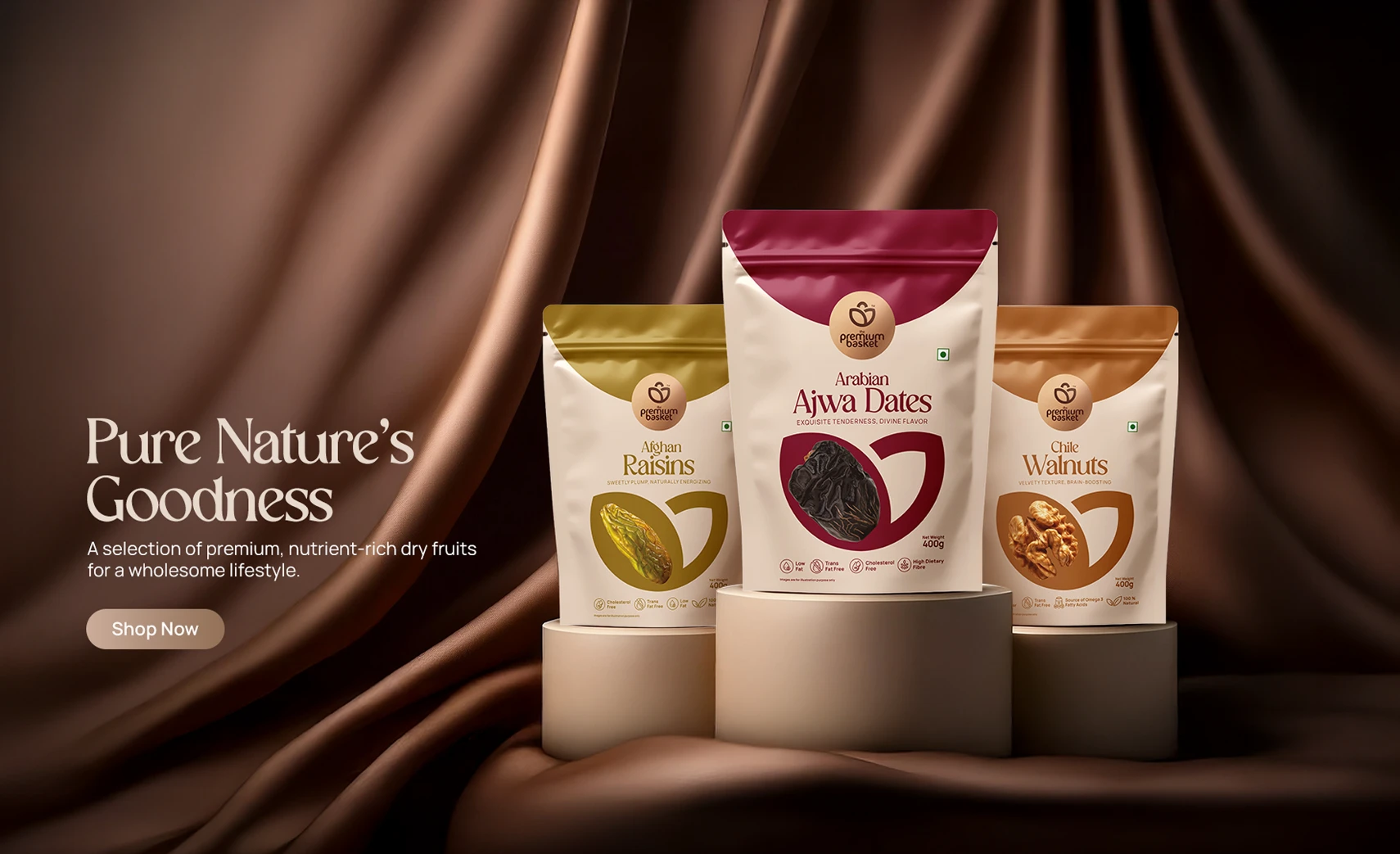
The rebrand brings clarity, structure, and elegance to a trusted name. A digital-first identity system that categorises products with ease, uses clean visuals, and reflects the premium nature of the offering—without losing its warmth or roots
Emotional Value
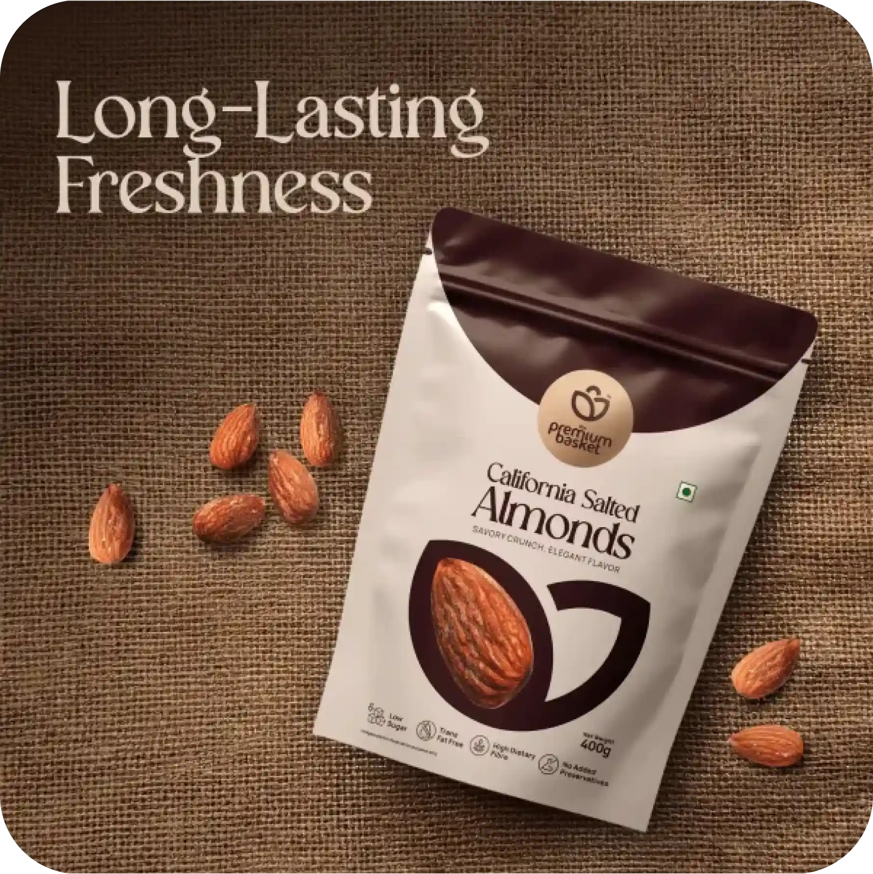
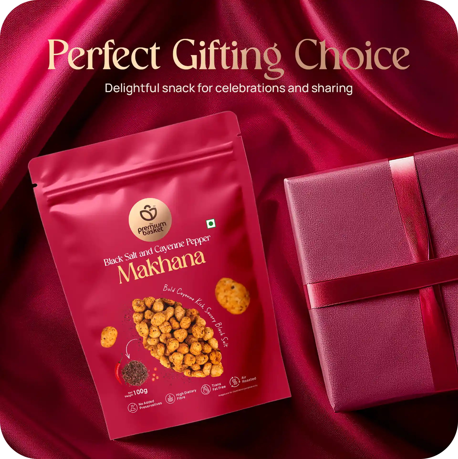
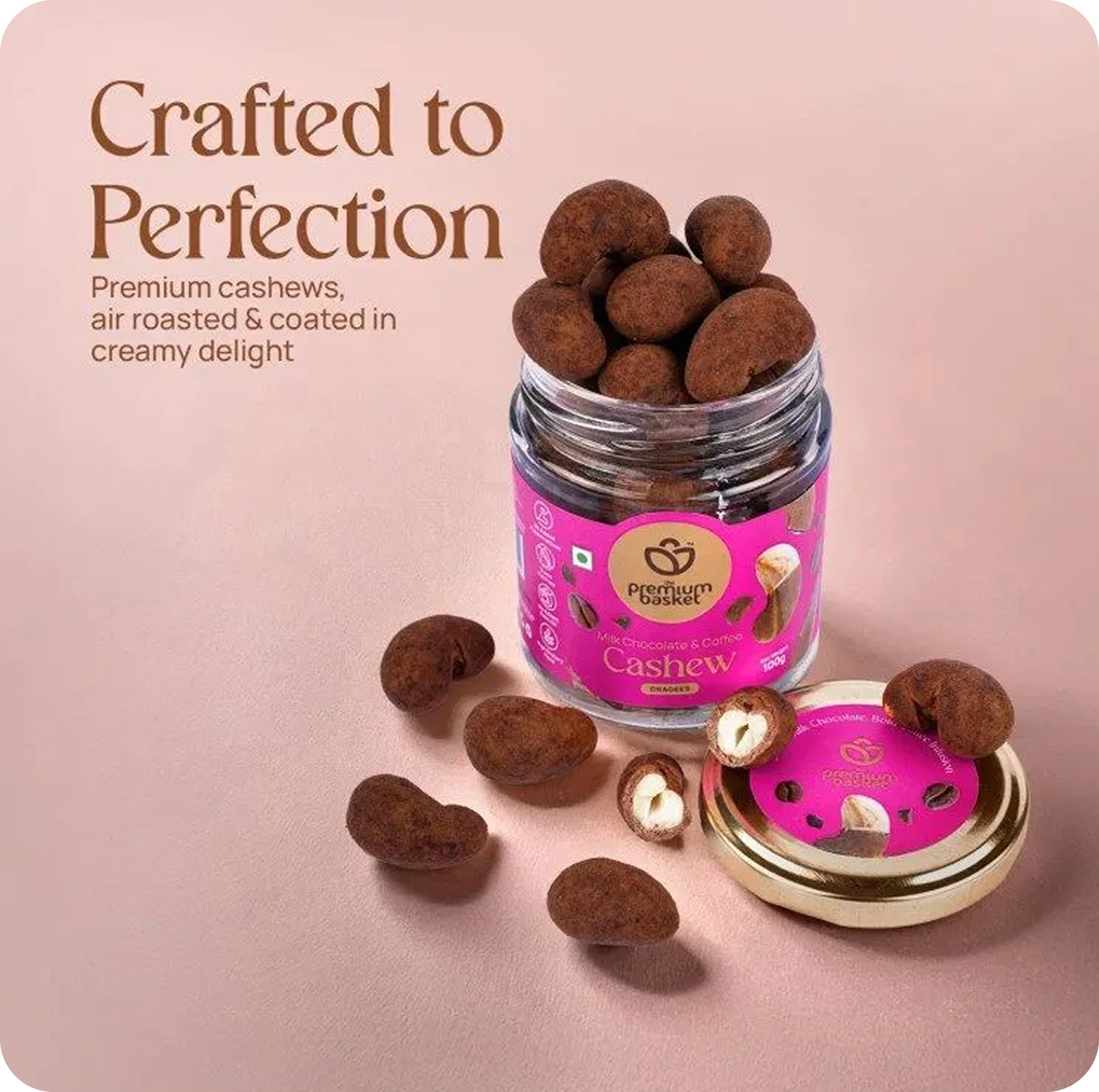
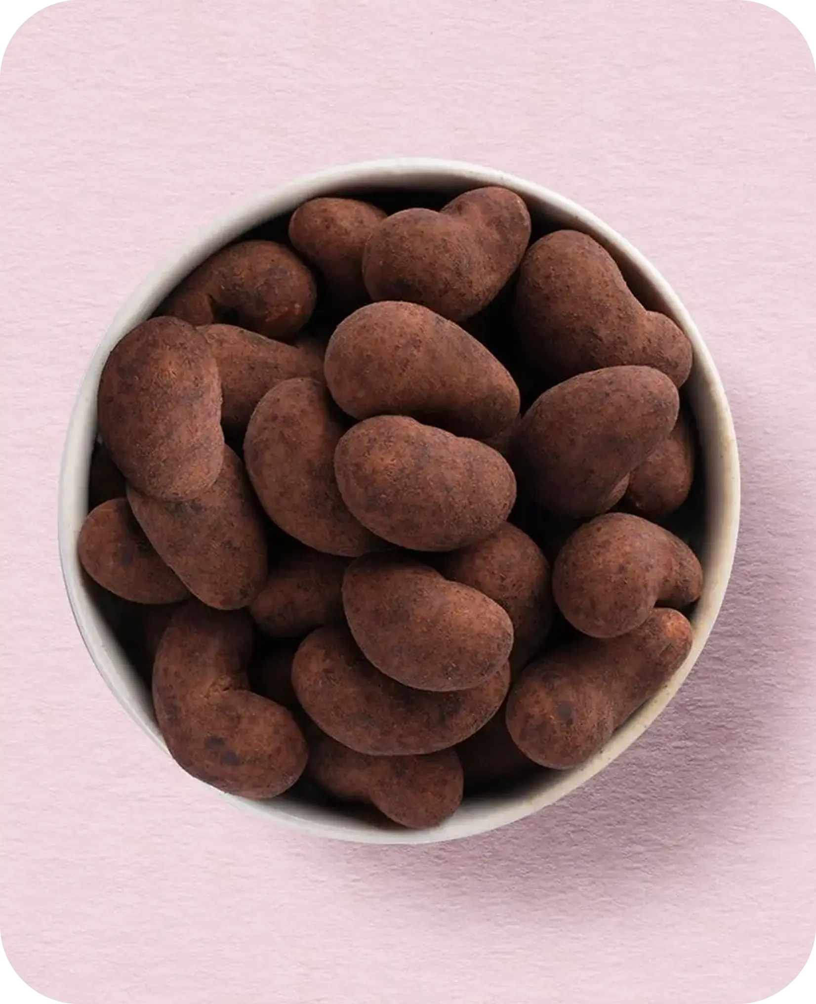
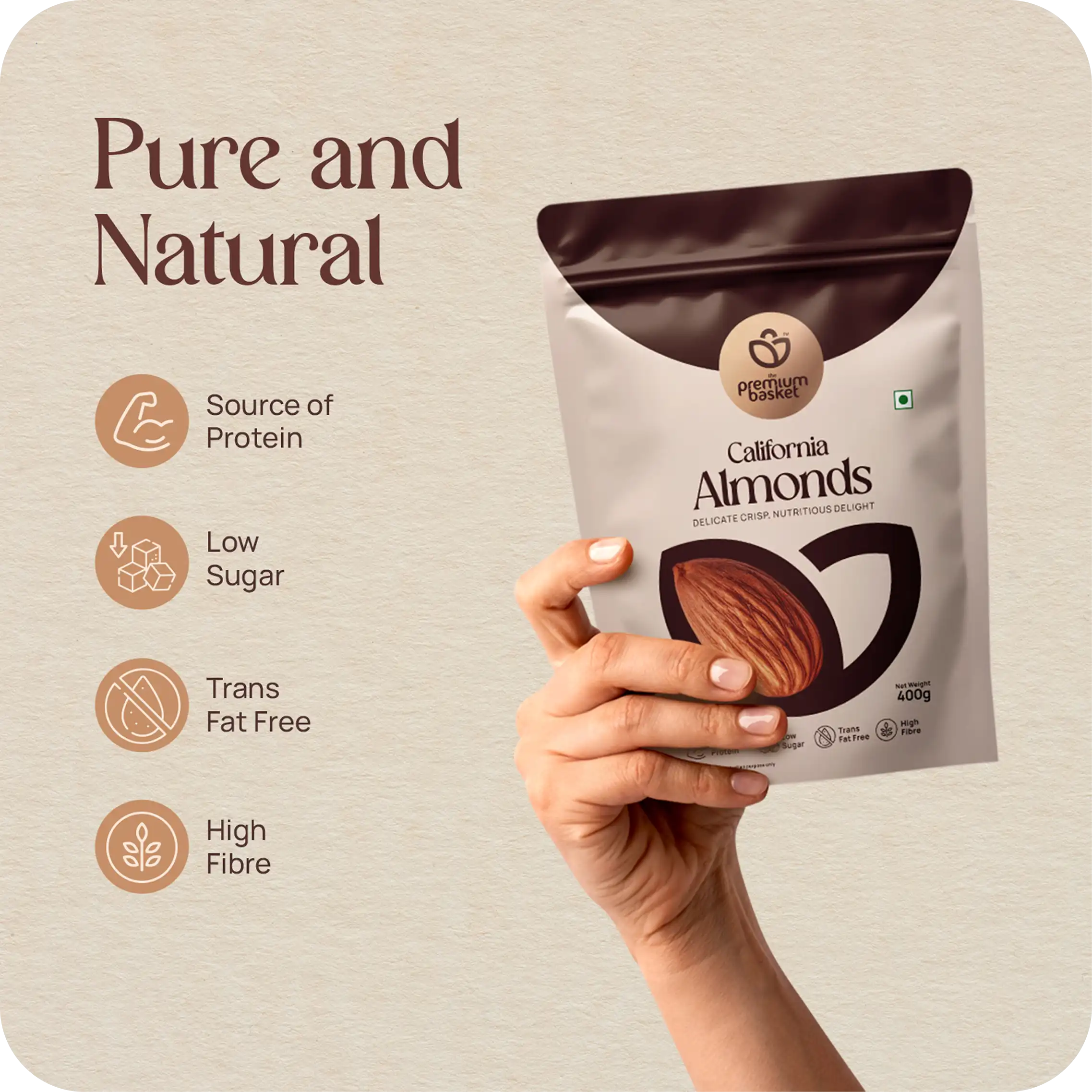
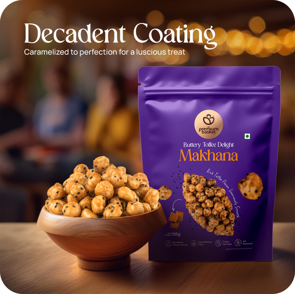
Premium Basket elevates dry fruits from routine to ritual—bringing beauty to daily nourishment. The tone, colour palette, and packaging are designed to evoke a sense of pride in choosing quality—for self or others
To honour a legacy of quality by creating a brand that feels trusted, premium, and thoughtfully designed for today.
The Brief behind the Basket
To create a scalable identity and a packaging system that feels premium, emotionally resonant and visually differentiating across the category which is ready to thrive across both shelves and screens.
The Identity Within
The symbol draws inspiration from the handle of a traditional basket, representing heritage and care held by elite customers who value quality. When brought together, the shapes form a basket of organic goodness, embodying abundance, trust, and the premium nature of the brand.
Handle of the basket held by elite customers
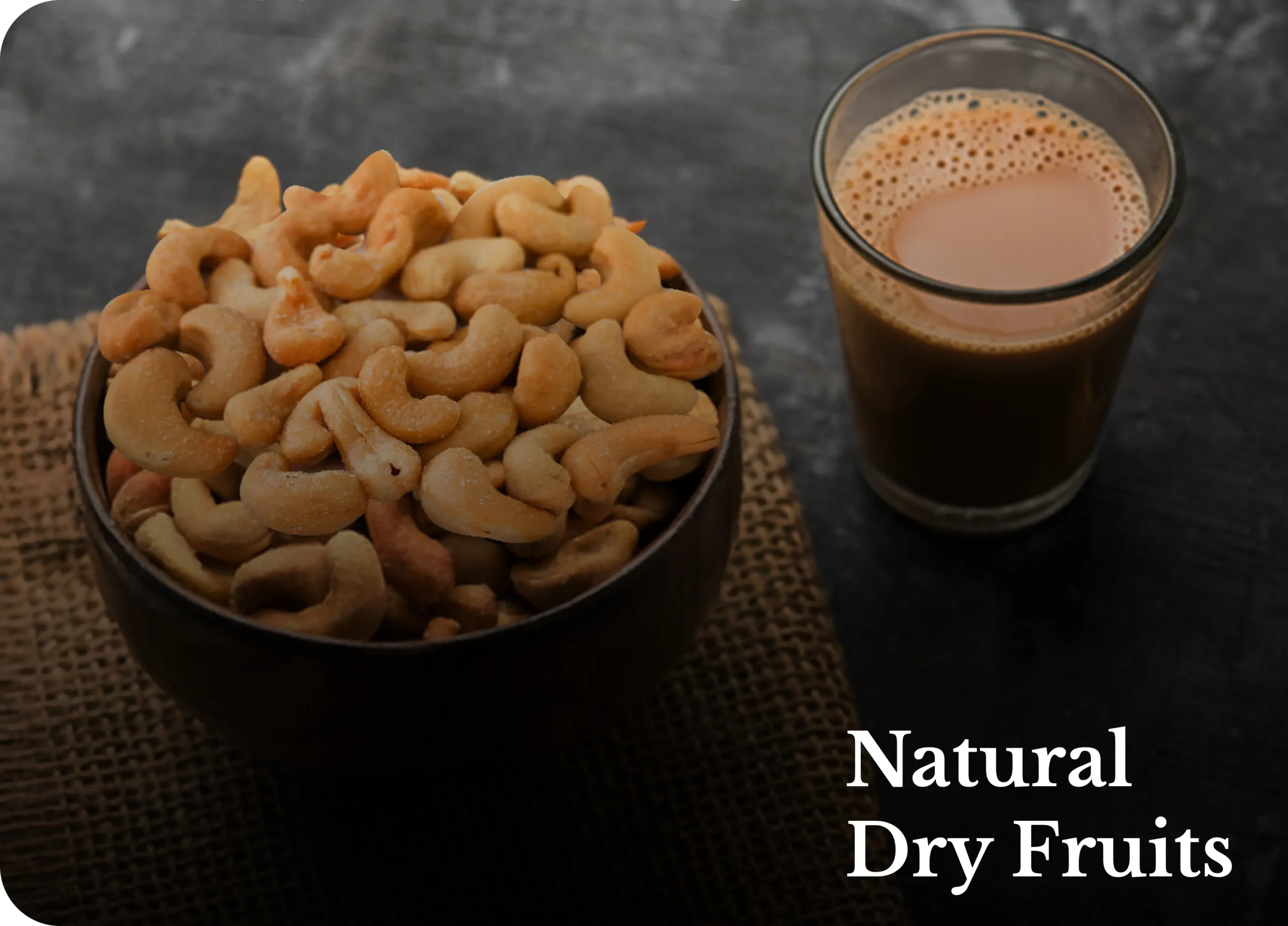
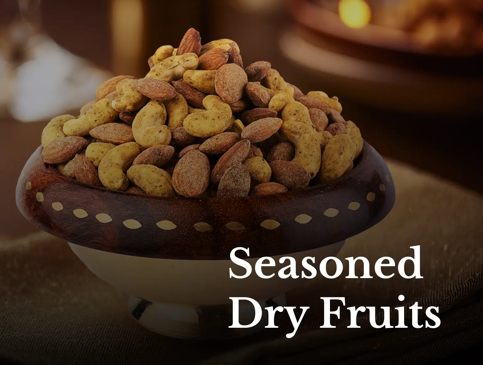
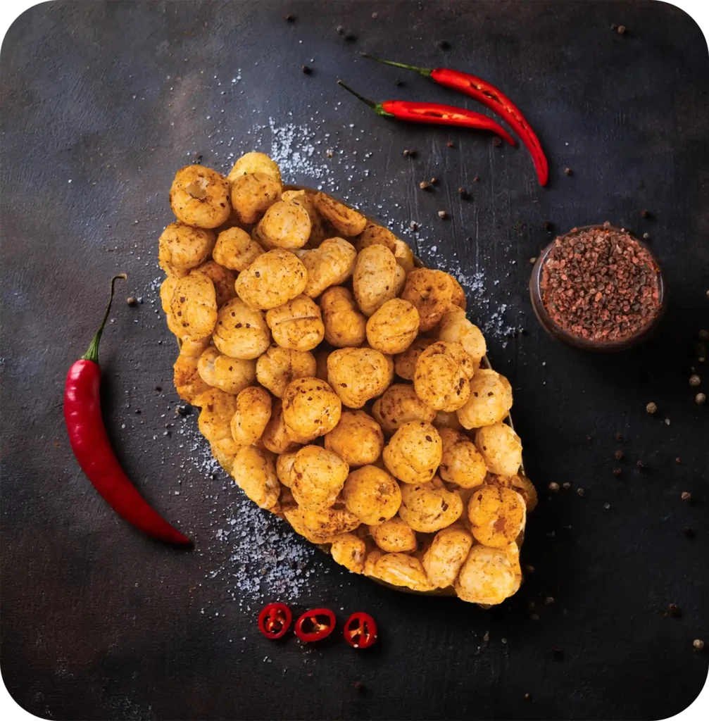
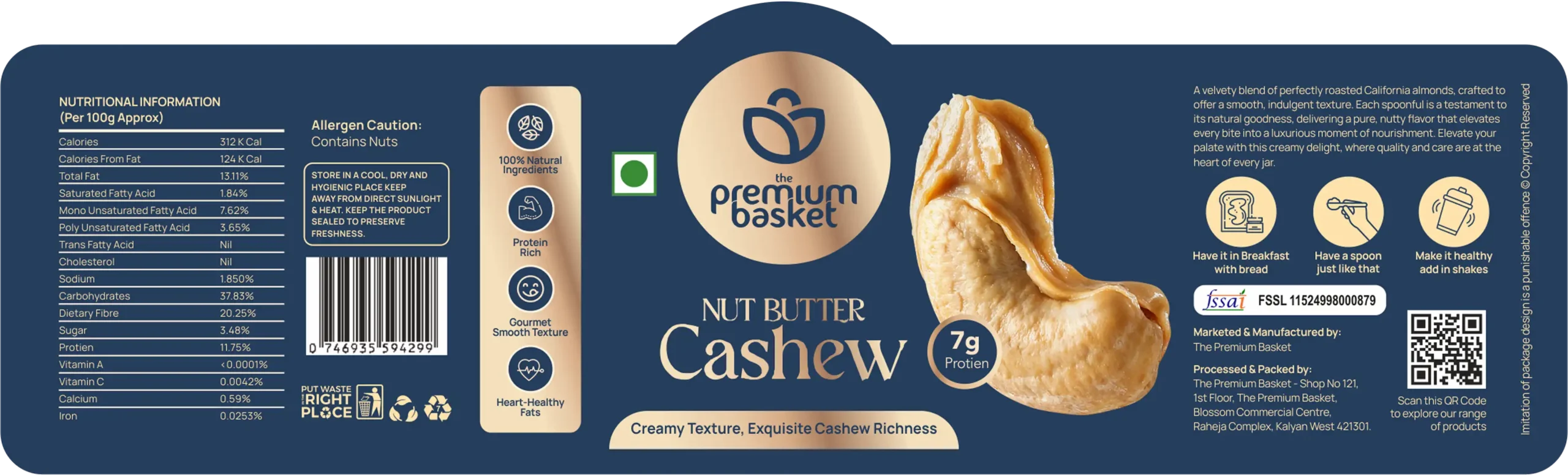
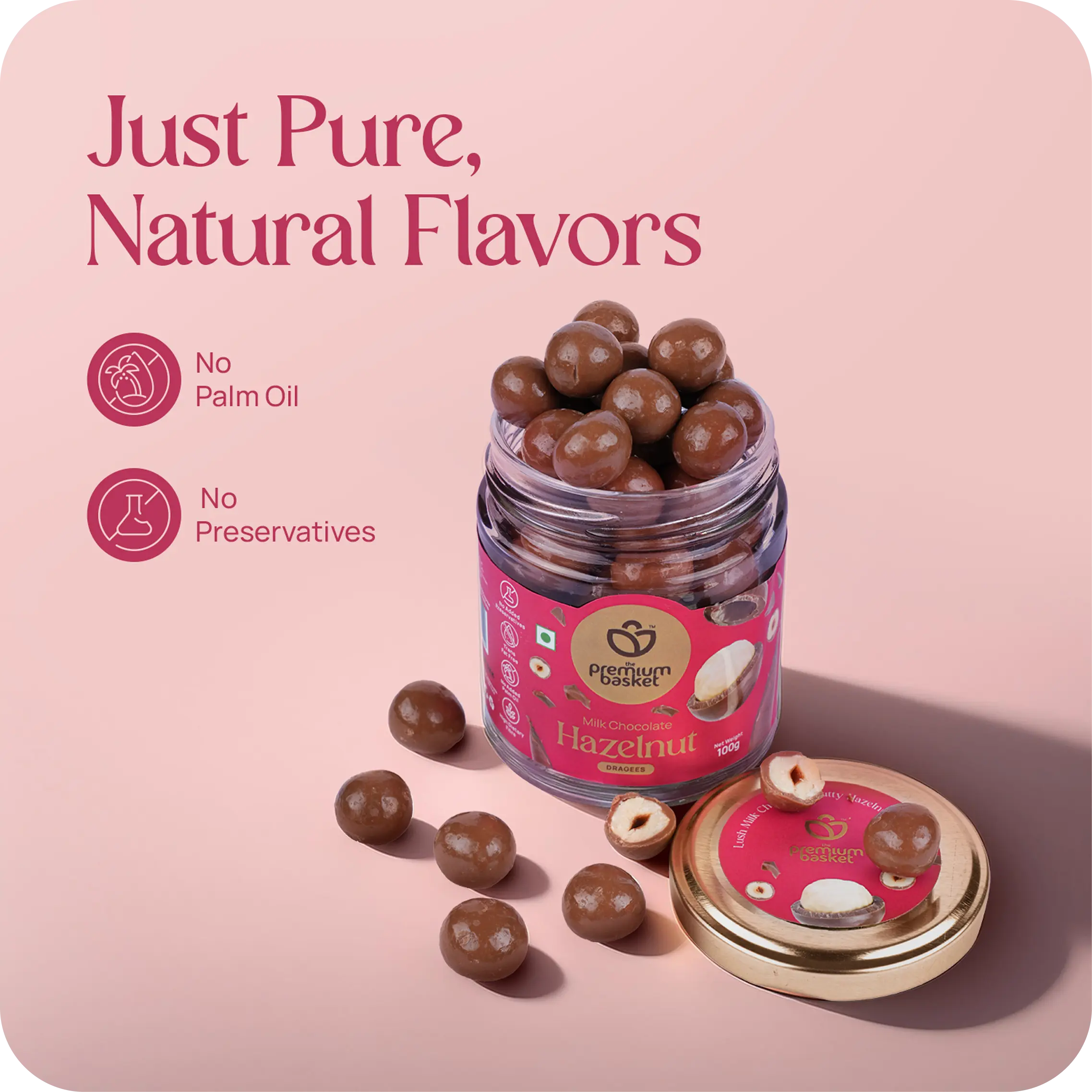
A basket of organic goodness as pure as a petal, as natural as a leaf, with every nut crafted for quality and care.
The Premium Typeface
Designed from the ground up, this custom typeface captures the elegance and warmth of The Premium Basket. Its soft curves and balanced proportions reflect the brand’s approachable yet refined personality, making every letter feel uniquely ownable and memorable.
The Typography System
A carefully selected brand fonts ensuring consistency across packaging, communication and digital platforms creating the right balance between readability and elegance.
Libre Baskerville
ABCDEFGHIJKLMNOPQRSTUVWXYZ
0123456789
Manrope
ABCDEFGHIJKLMNOPQRSTUVWXYZ
0123456789
The Colours
The primary colours metallic golden beige and blushed pink are inspired by the brand’s logo, creating a cohesive and recognizable identity. The golden hue reflects heritage, richness, and warmth, while the soft pink adds a touch of refined modernity. Together, they evoke a sense of premium indulgence, helping the brand feel both timeless and contemporary
Secondary Colours
Rich, bold tones used to distinguish product categories while maintaining a premium, vibrant look across packaging.
Pastel Colours
Soft, muted shades that aid in sub-categorisation and bring clarity and elegance to the overall packaging system.
Icons with Intent
The icons are custom-designed using minimal, clean line art to reflect the brand’s refined aesthetic. Each icon is thoughtfully crafted to visually communicate key ideas—like quality, freshness, or category distinctions—while maintaining consistency with the overall visual language. Their simplicity ensures clarity, scalability, and a cohesive premium feel across digital and physical touchpoints.
Introducing the House of Premiums
The complete range comes together as a cohesive system — one that respects legacy while speaking the language of today’s premium consumer. Each pack carries the same visual DNA: warmth in tone, clarity in structure, and elegance in form. Across SKUs, we’ve created consistency without monotony — ensuring the brand is instantly recognizable, yet category-specific. This unified packaging system not only reflects The Premium Basket’s heritage but also boldly fills the visual and structural gaps left by others in the market.
Product Categorisation
Natural Dry Fruits – Naturally Nourishing.
One Nut,
All the Difference
Each pack showcases a single, premium grade nut highlighting it’s natural size, texture and unmatched quality. Thereby standing out on the shelf.
Seasoned in Style
Flavours that Tell a Story
Each pack is a visual treat — wrapped in bold, rich hues that echo the intensity of the seasoning within. The flavour names take center stage with confident typography, while intricate, hand-drawn line illustrations of ingredients subtly frame the pack, adding depth and authenticity. Each variant is distinct yet cohesive, guided by a unified design language that speaks premium and flavour-first
Makhana, Made Elegant
Flavours that Tell a Story
Each pack is a visual treat — wrapped in bold, rich hues that echo the intensity of the seasoning within. The flavour names take center stage with confident typography, while intricate, hand-drawn line illustrations of ingredients subtly frame the pack, adding depth and authenticity. Each variant is distinct yet cohesive, guided by a unified design language that speaks premium and flavour-first
A distinct shape drawn from the logo forms the backbone of the visual language—creating a cohesive, ownable system that’s instantly recognizable and uniquely Premium Basket
Flavours that Tell a Story
Each pack is a visual treat — wrapped in bold, rich hues that echo the intensity of the seasoning within. The flavour names take center stage with confident typography, while intricate, hand-drawn line illustrations of ingredients subtly frame the pack, adding depth and authenticity. Each variant is distinct yet cohesive, guided by a unified design language that speaks premium and flavour-first
Visual Consistency Across Touchpoints
A cohesive visual system built on elegance, clarity, and warmth. From packaging to merchandise, every touchpoint reflects Premium Basket’s essence—premium, rooted in tradition, and crafted for today. Rich colors, minimal design, and the iconic logo unify the brand across digital and physical spaces.
Digital Expressions
A cohesive visual system built on elegance, clarity, and warmth. From packaging to merchandise, every touchpoint reflects Premium Basket’s essence—premium, rooted in tradition, and crafted for today. Rich colors, minimal design, and the iconic logo unify the brand across digital and physical spaces.
The Final Touchpoint
Seeing The Premium Basket on the shelf brings the entire brand vision to life. The unified packaging system creates instant recall across categories while clearly distinguishing each product family. Strong color blocking, consistent typography, and visual harmony allow the range to stand out in cluttered aisles — addressing the exact market gaps we identified at the start. From makhana to nut butters, every pack tells the same premium story, designed not just to sit on shelves — but to own them.
Unlock the potential of your ideas! 🚀
We're offering a Complimentary Brainstorming Session to bring your vision to life.